A closer look at one step of our custom bottle molds service; the full route, from drawing to approved sample, is set out there.
A 3D render of a glass bottle is dependable evidence for shape: silhouette, proportion, layout and how a range reads as a family. It is not evidence for anything the material decides, such as weight in the hand, glass clarity, closure fit, or how a metallic or printed finish really looks. Run concept comparison and internal sign-off on renders, then commission one physical piece for the direction that wins, and treat the dimensioned drawing, never the image, as the document a glass plant works from.
What a render can settle, use by use
Whether a render is "accurate" depends on the decision it is asked to support. Five uses account for nearly all rendering work on a glass packaging project, and each has its own blind spot.
| Use | Reliable for | Misleading on | Physical piece as well? |
|---|---|---|---|
| Internal design review | Outline, height against diameter, shoulder and neck form, the balance of cap to glass, fill level, label panel proportion, several directions compared under identical lighting | Heft and coolness, real clarity, wall thickness, the slight green cast of flint glass. Deliberate lighting also flatters every pack. | No, unless the disagreement is about feel instead of shape |
| Pitch to a channel or distributor | A shelf line-up seen at shelf distance beside competitors, assembled height with the closure on, front-of-pack hierarchy in a retail setting | Actual store lighting, the actual neighbours on shelf, and the impression formed when someone picks the pack up | Usually for gift, travel and premium channels. Often not for a plain functional pack. |
| E-commerce listing images | Clean front, back and angled views, matched lighting across a product family, dimension callouts, lifestyle or in-use frames that would cost a lot to shoot per variant | Print registration, decoration texture, how frosted or metallic surfaces throw back a light source, colours that shift with angle. Shoppers' screens are uncalibrated too. | Yes when the decoration effect sells the product, since a mismatch between listing and delivery drives returns |
| Pre-order or pre-launch campaign | A believable picture of the pack before tooling is paid for, bottle plus closure plus secondary packaging together, the range shown as a set | The distance between picture and delivered goods, which is exactly what customers measure on arrival. A paid campaign turns the image into a promise the plant has to keep. | Advisable before pre-orders open. One object costs little next to a launch whose hero image over-promises. |
| Tooling and decoration talks with the plant | A common reference for the intended outline, where decoration sits on the curve, the print area, and how label edges relate to moulded features | Manufacturability altogether: glass distribution, mould seams, draft angles on a non-round body, the working limits of a decoration process | Yes, once geometry is frozen. The plant needs a dimensioned drawing and a real trial. |
Read down the columns and one rule emerges. Geometry, silhouette, layout and consistency across a range come through a render intact. Anything that depends on light passing through glass, on a reflective coating, on ink sitting on a moulded surface, or on colour under lighting other than the chosen studio setup does not. That is the edge of the method, not a fault of the person who made the image.
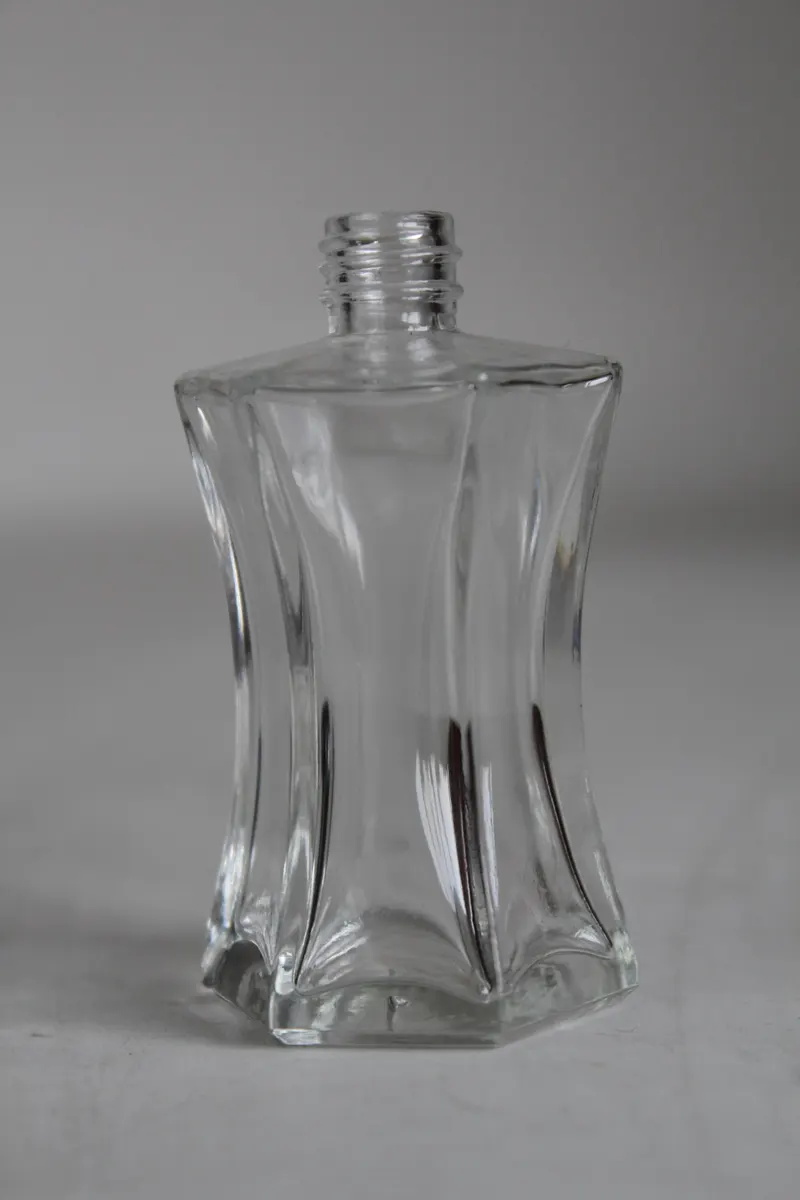
Category, channel and market set what the render must prove
Before any camera angle is chosen, three facts about the project determine which question the image has to answer. A brief that omits them tends to produce a handsome picture that settles a matter of taste and leaves the commercial question open.
What the pack holds
Fragrance, high-end spirits and luxury candles sell largely on look and touch. For these, rendering pays for itself by fixing proportion, shoulder form, the mass of the closure and the glass-to-cap balance well ahead of any glass being formed. Beverage bottles, pharmaceutical containers and household refills are judged on legibility, fill behaviour and room for regulated text, so the image that counts shows the pack at its real viewing size with the mandatory block in place.
Where it is sold
On a busy retail shelf the pack is seen from a distance, among rivals. The render should be composed the same way: a row of packs under shelf lighting, not a lone hero bottle against a gradient. Online, the pack has to work as a thumbnail and a short image set, shrunk to a few hundred pixels, which normally calls for less detail, a stronger silhouette and a simpler label hierarchy than a studio image would suggest.
Gift and travel retail are the hard case. There the judgement happens in the hand, and weight, coolness and the feel of a closure are properties of material, not of pictures. Naming the channel therefore tells you both how to frame the image and how far to trust it.
Labelling rules in the destination market
Mandatory text has a minimum size relative to the pack. Content and allergen declarations take up a defined area, and some markets demand particular symbols or a set information panel. These are layout constraints, and an image is a very cheap place to show that the required block and the brand can share a curved surface without crowding.
For cosmetics and fragrance, the relevant frameworks are FDA 21 CFR in the United States and the EU cosmetic and food-contact rules in Europe. A render does not verify compliance. It does show whether the space set aside for declarations is realistic, which is far better learned now than after tooling has been ordered.
Closures and bespoke shapes
If the closure is a pump, sprayer or dropper, render the assembled pack. The actuator adds height above the shoulder, and the assembled proportion is normally the impression people remember. For fragrance, our overview of perfume bottle formats describes how shoulder, neck and actuator read together. Once the image starts implying an outline that standard moulds cannot supply, the extra development items are listed under custom perfume bottle development.
Where rendering sits between concept and production sample
A project passes through five stages on the way to production, and the weight a render can carry falls at each one.
- Concept. A rough silhouette, a capacity target, a closure family and a first label idea. Nothing is fixed and every change is cheap, so this is where digital work is most efficient. An image can be revised, re-lit and re-labelled far faster than any physical method allows, and several concepts shown together under one lighting setup make differences in proportion much easier to see than inspecting them separately on different days.
- Internal alignment. Brand owner, marketing and packaging leads must agree before money goes into tooling or a decorated sample. A render shown at true scale from the relevant angles is normally enough. What this stage produces is agreement; the image is only the tool.
- External communication. Retail partners, distributors, licensors and end clients cannot be briefed as thoroughly as colleagues, and they take a picture as a promise, not a proposal. The image has to be frank about what it leaves out and must show the closure fitted, or the viewer will assume the delivered pack is identical.
- Layout verification. Real artwork, mandatory text and label geometry go onto the real curve at real size. Rendering does most of this job, and it is also where its limits surface: label behaviour on an actual curve, print opacity on actual glass and the true contrast of decoration under shop lighting are material facts.
- Production-process sample. The first object able to answer mechanical and manufacturing questions. Thread engagement, sealing, survival on the filling line and glass distribution in the mould have nothing to do with rendering.
The discipline is knowing which stage you are in and not borrowing answers from a later one.
Why the finished bottle differs from the image
The gap is predictable. It comes from four physical causes, and a buyer who knows them can tell in advance where the delivered bottle will disappoint.
Transparency
Glass transmits and bends light, so part of what you see is whatever sits behind and inside the bottle. Software approximates refraction, but wall thickness, the small variations in wall distribution left by forming, and the glass colour itself all change the result. Flint glass is never perfectly colourless: a faint tint appears against a white surface or next to a truly clear competitor.
Amber absorbs light instead of reflecting it. Its colour deepens with the depth of glass the light crosses, so one amber bottle looks darker at a thick base than at a thin shoulder.
Metallic coatings
Vacuum metallising, hot stamping and metallic spray all produce a surface whose appearance is borrowed from its surroundings. In a render those surroundings are a studio setup, so a gold cap looks even and controlled. In a shop the cap mirrors the ceiling, the shelf, the pack beside it and the shopper, and its colour moves as the viewer does. Buyers who approve metallics on screen regularly find the real piece either duller or harsher. When a metallic effect is central to the design, use the image for shape and position only.
Decoration on glass is a layer of ink or fired ceramic on a moulded surface. It has thickness, an edge quality and an opacity that a flat texture map cannot reproduce. Ink over amber behaves differently from ink over flint. A pale colour on a dark body needs heavier coverage and reads heavier. Fine lines and small reverse-out details can fill in on the real bottle with no warning from the render.
Registration, meaning how accurately one print colour lines up with the next, is a genuine production variable. Discuss it over a decorated sample, not over a picture.
Colour under real light
An image is delivered at a chosen white balance, opened on a monitor that is probably uncalibrated, then judged in an office, a showroom and a store, each lit differently. A colour that matches on screen can turn warmer, cooler, flatter or muddier in each place, and two monitors can visibly disagree over one file. So a render is a good way to approve where a colour sits and a poor way to approve the colour. Base colour approval on a physical reference and a measured value.
Three decisions that need a physical object
The handover from image to object comes at three recognisable points. Missing them is how an unverified assumption reaches tooling.
- Anything judged in the hand. Weight, balance, the cool touch of glass, grip at the shoulder, the sound and resistance of a closure turning, the sense of substance from a heavy base. If the product's appeal depends on these, the render proposes and the object confirms. This is the normal situation for gift, travel and premium packs, and wherever the closure action is part of the experience.
- The glass-to-closure interface. Does the finish take the cap, does the thread run smoothly, does the sealing band or plug seat properly, does the pack hold its contents? These are engineering questions, answered on real glass with the intended closure. No amount of rendered detail substitutes.
- A decoration or finish the brand must approve by eye. Print effects, metallics, frosted or acid-etched surfaces and specific colours need sign-off on a physical piece under a defined light. Approving the rendered version approves only an illustration of the effect.
Outside these three, an object mostly repeats what the image already settled. The economical route is to explore and align on renders, then build a single piece for the surviving direction and use it for both the external conversation and the layout check. Making objects for options the render had already ruled out is the most common avoidable expense at this point. How to build and interpret that piece is covered in our guide to physical mock-ups and decorated samples.
Six items to send for a usable render
Renders that come back unusable are seldom badly made. More often they answer a question nobody meant to ask, because the brief left out the facts that mattered. Six inputs turn a picture into a working document.
- Dimensions, as numbers. Overall height, maximum body diameter, base diameter, neck height, neck finish, and target capacity with its unit. If the bottle is not yet fixed, give the limits: the tallest pack the shelf or gift box will take, the diameter the filling line accepts, the acceptable capacity band. Work built on dimensioned constraints can later become a drawing. Work built on a mood reference is an illustration that gets redone when the numbers arrive.
- Decoration positions, as measurements. "Logo high on the shoulder" is ambiguous on a curve. A print area that begins a stated distance below the moulded shoulder transition and spans a stated width across the front is something a modeller can act on. For a front label and back panel, give panel dimensions and the alignment reference, since the reference feature decides whether the layout repeats from one piece to the next.
- Colour references, split three ways. Glass colour, print colour and metallic finish are separate specifications. Give a standard colour system value for print, a reference piece or described tone for the glass, and say whether the metallic is a coating, a foil or a fired deposit. A screenshot is not a specification; it produces an image that matches the screenshot.
- Reference images, one purpose each. A reference can stand for silhouette, shoulder proportion, neck height, closure style, label layout or overall mood. Mix those in one picture and the modeller copies things you never intended. Tag each reference with the single feature it is there to show.
- Intended use and output set. Internal review needs a few comparison angles under one lighting setup. A listing needs matching front, back and angled views across the family, at the resolution and crop of the listing template. A channel pitch needs the shelf line-up and the assembled pack. A pre-order campaign needs the family view and secondary packaging. Camera work, lighting and rendering time all follow from this list, so state it first.
- Destination market and labelling requirement, at least in outline. If an information panel, allergen declaration or minimum text size applies, say so before composition, so the space is reserved instead of found missing. This is the item most often left out, and the commonest reason a correct-looking render is redone.
When you brief us, add the stage the project has reached and whatever material already exists, even a rough sketch with dimensions. The stage tells us which decisions the image is expected to carry and when an object will be needed. The existing material shows how much modelling and interpretation the job involves and which facts are still missing. From that we can say what the render will and will not decide, what is needed before work starts, and when a physical piece becomes the better spend. A moving outline usually points to a render first; a project that turns on decoration or closure finish usually goes to a physical piece sooner.
Using the render alongside the drawing
After the design decision the image keeps working as a shared reference between buyer, designer and glass plant. It cuts miscommunication as long as everyone treats it as a statement of intent.
Its strength is fixing the intended look in one place. With all parties viewing one annotated picture, talk about proportion, decoration placement and closure balance becomes concrete. That alone justifies commissioning a good render even when a physical piece is sure to follow.
Its limit is that nobody can make glass from a picture. Production runs from a dimensioned drawing and a mould. The drawing defines wall thickness, draft on a non-round body, the finish, and how glass is distributed in the parison, the pre-formed gob that is blown into the final shape. A beautiful non-round outline on screen says nothing about whether it can be formed.
The working rule we apply when checking drawings:
- Send both files.
- Label the render "visual intent" and the drawing "manufacturing definition".
- Where they differ, the drawing governs and the render is updated afterwards.
Projects that blur the two end up arguing over whether delivered bottles match a picture, when the real test is whether they match the drawing.
The image also has a modest role at inspection. Once decoration or finish has been approved on a physical piece, the render can sit next to the inspection standard as a quick visual check of decoration position and area. The formal criteria are dimensional and normally verified by sampling inspection. ISO 2859-1 is the sampling procedure usually cited when an inspection plan is agreed, and it should be named in the purchase documents instead of assumed. The render illustrates that process; it is not a criterion within it.
What drives rendering cost and schedule
Rendering gets under-budgeted when it is treated as a by-product of design. Give it its own line and deliverables, and it stops arriving late because nobody owned it. The fee is quoted per project, and three things move it:
- Modelling. This scales with how much is bespoke. A standard bottle, standard closure and flat label model quickly. A custom outline, a complex closure assembly and a surface decorated in several print colours take materially longer.
- Materials and lighting. Effort rises with how closely the image must approach a glass, metallic or printed effect.
- Revision rounds. The most forgotten component and usually the one that decides the final bill. Expect more than one round, because the first image always exposes something the brief did not foresee. Agree beforehand how many rounds are included and what counts as a new direction instead of a revision.
Schedule follows the same pattern: the revision loop lengthens with the number of reviewers. The largest avoidable delay is committee review that returns impressions instead of dimensional comments. One decision-maker looking at an image for an hour produces a direction. Six people looking at it over a week produce a meeting and a request to start over. Name one decision-maker and gather every comment into a single written list before it goes back to the modeller.
Spend the cheap early churn on renders while the outline is still changing, fix the direction on the one that survives comparison, then order a single physical object. Paying for renders to explore is money well used. Paying for more renders to re-approve a direction already confirmed physically is duplication.
Tooling comes after that. A render that is still altering the outline is a signal to hold the mould order, not to place it, and an image cannot tell you what a mould will cost to cut. Our page on how mould tooling is charged and what drives the bill deals with that decision.
Questions buyers ask about 3D bottle rendering
Can a 3D render replace a physical sample?
For geometry, proportion, silhouette and layout, yes. That covers most early-stage work and is why rendering is the usual first step. For weight, clarity, tactile feel, closure fit and the look of a decoration or metallic finish, no. Those questions go forward to a physical stage.
Is a render enough to present to a distributor or retailer?
It is enough to show a direction and compare options, as long as the closure is fitted in the image and nothing is implied that the picture cannot support. It is weaker when the audience will handle the pack, as happens in gift, travel and premium channels. There, one physical object beside the render tends to close the discussion faster than further images.
Can rendering be done before tooling is committed?
Yes, and this is among its clearest uses. A direction can be shown to colleagues, to a channel partner and in launch preparation before any tooling money is spent. The image cannot prove the shape is manufacturable, so keep the tooling decision separate and wait until the outline has stopped moving.
Which input is most often missing from a render brief?
The destination market and its labelling requirement. Dimensions, decoration coordinates, colour references and tagged reference images usually arrive in some form. The space for mandatory text is what gets forgotten, and the layout then has to be recomposed.
How do we keep the revision loop short?
Route feedback through one person and send it as one written list, phrased as dimensional comments where possible. Settle the number of included rounds, and the line between a revision and a new direction, before work begins.