


Why clarity is a specification, not a preference
Flint glass is not one thing. Iron content in the batch shifts clear glass towards green, and the shift is invisible against a white studio background but obvious in a bottle full of colourless liquid standing next to a competitor on a backbar. For vodka and gin this is a real specification question rather than an aesthetic one, and it is worth asking to see samples from the actual production line rather than a polished showpiece.
Some plants run a lower-iron batch for exactly this, usually sold as extra flint or super flint. Not every line has it and not every mould is run in it, so if clarity is the brief, ask for it by name and ask which moulds it applies to.
Wall thickness distribution matters for the same reason. An uneven wall reads as distortion when you look through the bottle at the label on the far side — a defect that barely registers in amber or green glass and is immediately visible in flint. Dimensional and wall-thickness checks against the approved drawing are part of the lot inspection for exactly this reason.
The shapes in this range
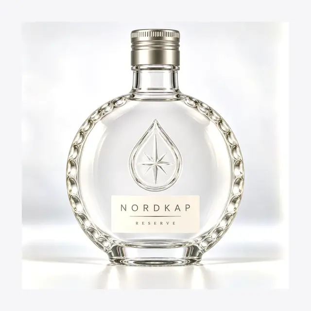
White spirits split fairly cleanly between bottles that want to look engineered and bottles that want to look botanical or artisanal. The moulds below cover both.
Tall squares and rounded rectangles
The modern premium vodka read: flat faces, sharp vertical lines, generous label area. Squares also block more shelf frontage per unit than a round of the same capacity, which buyers who negotiate planogram space notice.
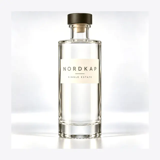
Cylinders
Minimalist and quietly expensive-looking when the glass quality is there, because a cylinder has nothing to distract from wall clarity. Also the friendliest shape for high-speed lines and for wrap-around labels.
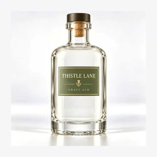
Bar-top rounds
Where gin programmes usually land. A cork or wood-topped closure signals craft distilling, and the round body suits the illustrated, botanical label styles the category has settled into.
Screw-finish rounds for ROPP lines
Volume and private-label work. Faster capping, better tamper evidence, and closures that hold up through long-haul distribution better than cork.
Decoration is where the brand actually happens
Because the liquid is clear, anything applied to the glass reads twice — once on the front face and again through the bottle from the back. Screen printing exploits this deliberately: a mark printed on the rear panel appears to float inside the liquid when viewed from the front. It is one of the few decoration effects that is genuinely unavailable to brands using coloured glass.
Frosting and spray coating go the other way, turning the bottle opaque and making it a solid object rather than a window. Both are common in gin, where a matte surface pairs with the botanical illustration style. Embossing — a botanical motif, a wordmark, fluting — works into the mould itself and needs to be agreed before tooling.
Whichever route you choose, ask to see it on the actual mould rather than on a render. Print behaves differently across a curved shoulder than it does on a flat panel, and the difference between an approved artwork file and an approved sample bottle is where most reprints come from.
Fill sizes and market fit
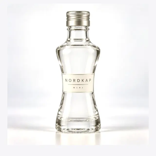
Several moulds in this range run at both 700ml and 750ml, which covers the EU/UK and US standards respectively. Smaller formats matter more in white spirits than in aged categories: 50ml and 250ml pours drive trial, travel retail and event sampling, and a brand that launches without a small format usually ends up sourcing one within a year from a different supplier, with a different glass colour.
If a small format is anywhere in your roadmap, it is worth specifying the family at the same time as the flagship so the glass, the decoration and the closure all match. Our miniature and sample formats are listed separately, and several share decoration routes with the moulds on this page.
From brief to container
Tell us the fill, the destination market, the annual volume estimate and whether the closure is already decided. You get back a technical drawing confirming capacity, neck finish and critical dimensions, and sample bottles for a line trial before production is committed.
Minimum quantities and lead times move with the decoration route and current line scheduling, so we quote them per project. Inspection documentation — annealing per ASTM C148, internal pressure per ISO 7458, thermal shock per ISO 7459 — ships with the lot.
Common questions
How do I check that flint glass is actually colourless?
Ask for production samples, not showpieces, and look through the length of the bottle against a white sheet — the green cast from iron content shows in the glass thickness at the heel and shoulder long before it shows in the wall. Comparing side by side with the competitor bottle you are benchmarking against is more informative than any numeric specification.
Can gin and vodka share a mould across a portfolio?
Frequently the right call. A shared silhouette with different decoration gives portfolio coherence, keeps you at one set of minimums instead of two, and simplifies the closure and carton spec. It is worth resisting only when the two brands need to compete against each other on shelf.
Does frosting affect recycling or food contact compliance?
Acid-etch and sprayed matte finishes are standard in the spirits trade and do not change the glass contact surface, which is the bottle interior. Requirements differ by destination market, so tell us where you are shipping and we will confirm what documentation the factory can supply for that market rather than assume it transfers.
What is the practical difference between ROPP and continuous thread?
ROPP closures are formed onto the finish during capping, which gives a tamper-evident band and a tight seal at line speed; continuous-thread caps are pre-formed and screw on. ROPP is the norm for spirits at volume. The two need different neck finishes, so the choice has to be settled before the mould is cut.