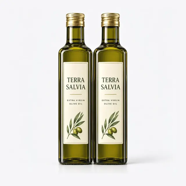
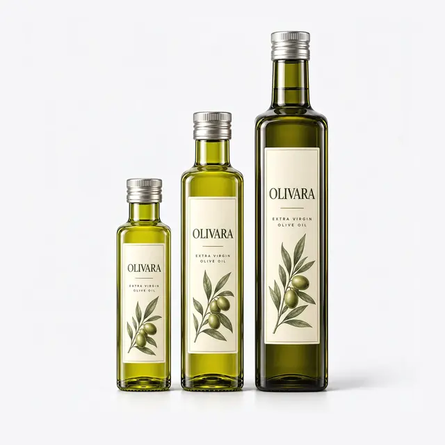
The Series 1792 is a light green square marasca olive oil bottle in the small-to-medium format class, with tall, uninterrupted flat panels on all four faces, a smooth unembossed body, and the standard 31.5 mm threaded olive oil neck. Its proportions suggest the 250 ml to 500 ml range that brands use for daily-kitchen and gift-adjacent SKUs, but the real story of this bottle is its surface: it is one of the cleanest branding canvases in our olive oil range. If your competitive strategy depends on label design, shelf blocking, and brand recognition rather than bottle novelty, this page explains why a flat-panel marasca like Series 1792 is the professional’s substrate of choice. Exact capacity, weight, and dimensions are confirmed on the technical drawing at quotation.
Walk down any olive oil aisle and the pattern is obvious: the bottles that win attention are rarely the strangest shapes. They are the ones whose labels read instantly from two meters away. A square bottle with flat, vertical, undistorted faces gives your designer complete control of that first impression, and it keeps giving control at every later stage, from label application on the line to shelf alignment in the store.
Flat Panels: Why Designers Prefer the Marasca Canvas
Curved bottles fight typography. On a round container, long brand names bend around the arc, small legal text compresses at the label edges, and fine linework distorts where the curvature is tightest. The flat panel of a marasca eliminates all three problems. Your label prints and applies exactly as it appears on the designer’s screen, which means serif wordmarks stay crisp, certification logos stay legible at small sizes, and barcode quiet zones remain scannable without special placement tricks.
The tall, nearly full-height panel visible in the photo also gives unusual vertical freedom. Origin seals and harvest dates can sit high near the shoulder where enthusiasts look for them, the brand block commands the optical center, and regulatory text settles low without crowding the design. For extra virgin olive oil, where the label routinely carries origin, cultivar, acidity, harvest date, and awards, that breathing room is not a luxury; it is a requirement for a label that sells instead of merely informing.
Light Green Glass and the Brand Palette
The lighter green tone of Series 1792 suits a specific brand strategy. It shows more of the oil’s natural golden-green color than dark antique glass, which flatters early-harvest and filtered oils whose hue is part of the sales argument. It also pairs beautifully with warm label palettes: cream papers, terracotta accents, and gold foils read richly against light green glass, while dark green bottles tend to demand heavier, high-contrast designs. If your brand identity is built on freshness and Mediterranean lightness rather than tradition and weight, this tone supports it.
Keep the trade-off in mind, however: lighter glass transmits more UV, so oils in this bottle are best positioned for faster turnover, protective secondary cartons, or retail environments without harsh display lighting. Many brands run light green for their everyday line and dark antique green for long-shelf-life SKUs; tell us your channel plan and we will advise on the split.
Decoration Beyond Paper Labels
The flat faces of this bottle accept the full decoration toolkit. Screen printing bonds ink directly to the panel for a no-label look that survives kitchen handling. Acid-etch frosting adds a premium matte field for minimalist designs. Color coating can transform the whole bottle for limited editions. Foil-blocked pressure-sensitive labels on textured papers remain the most flexible option for multi-SKU ranges. Every decorative process has its own MOQ and cost curve, and we produce pre-production samples for approval before any decorated bulk run starts.
There is also a shelf-blocking advantage unique to square bottles. When a retailer faces a row of marascas, the flat front panels combine into a continuous brand wall with no curved gaps breaking the design between units. Brands that coordinate label artwork across SKUs, for example a shared background color that runs from the 250 ml to the 750 ml bottle, can turn a modest shelf allocation into what looks like a branded display. Discuss multi-SKU artwork coordination with us when you request die-lines; small layout decisions made early pay off every day the range sits on shelf.
Closure and Presentation Finishing
The standard 31.5 mm threaded finish takes ROPP aluminum caps with tamper-evident bands, non-drip pourers, and capsule over-finishes in colors that complete your brand palette. Because the capsule and cap are highly visible at shelf height, we recommend sampling cap colors against your label artwork; we supply matched closures and deliver the bottle-cap set leak-tested together. Confirm the finish drawing with the factory before sourcing closures elsewhere.
Quality Assurance for a Presentation-Critical Bottle
A bottle sold on its appearance is inspected on its appearance. Series 1792 production includes cosmetic grading for seeds, blisters, and surface marks on the label panels, alongside the mechanical regime: ASTM C147 internal pressure, ISO 7459 thermal shock, and ISO 8113 vertical load. The glass is food-contact soda-lime with compliance documentation for export markets; our China import guide covers how inspection and documentation fit the order timeline.
MOQ, Packing and Next Steps
Bottles pack in divider cartons on shrink-wrapped pallets as shown below, with panel-protecting carton dividers standard on decorated runs. Minimums vary by stock status and decoration; our MOQ explainer details the structure. For die-lines, decoration pricing, and a quotation with confirmed capacity and lead time, contact our team with your artwork stage and target volumes.
Frequently Asked Questions
What is the MOQ for Series 1792, including decorated runs?
Plain stock glass carries a container-scale minimum, while screen printing, frosting, or coating each add their own decoration MOQ quoted per process. Send your target quantity and decoration plan and we will quote both figures together.
Can I get samples with my label applied or screen-printed?
We supply plain samples immediately for size and line testing. Decorated pre-production samples with your artwork are made for approval before any decorated bulk run, so you can validate colors and registration in hand.
Which closures and capsule colors are available?
The bottle uses the standard 31.5 mm olive oil finish, accepting ROPP aluminum caps, tamper-evident bands, non-drip pourers, and colored capsules. We recommend sampling cap and capsule colors against your label artwork, and we supply matched closure sets.
Is light green glass protective enough for olive oil?
Light green glass transmits more UV than dark antique green, so it suits faster-turnover SKUs, oils sold in secondary cartons, or retail without harsh lighting. Many brands run light green for everyday lines and dark glass for long-shelf-life products.
What label size fits the flat panels?
Panel dimensions are provided as die-line drawings with your quotation so your designer can work to exact measurements. The tall, near-full-height panels accept generous front and back labels with room for origin seals and regulatory text.
What quality checks protect the bottle’s appearance?
Production includes cosmetic grading for seeds, blisters, and panel surface marks, plus mechanical testing to ASTM C147, ISO 7459, and ISO 7458. Decorated runs ship with panel-protecting carton dividers as standard.