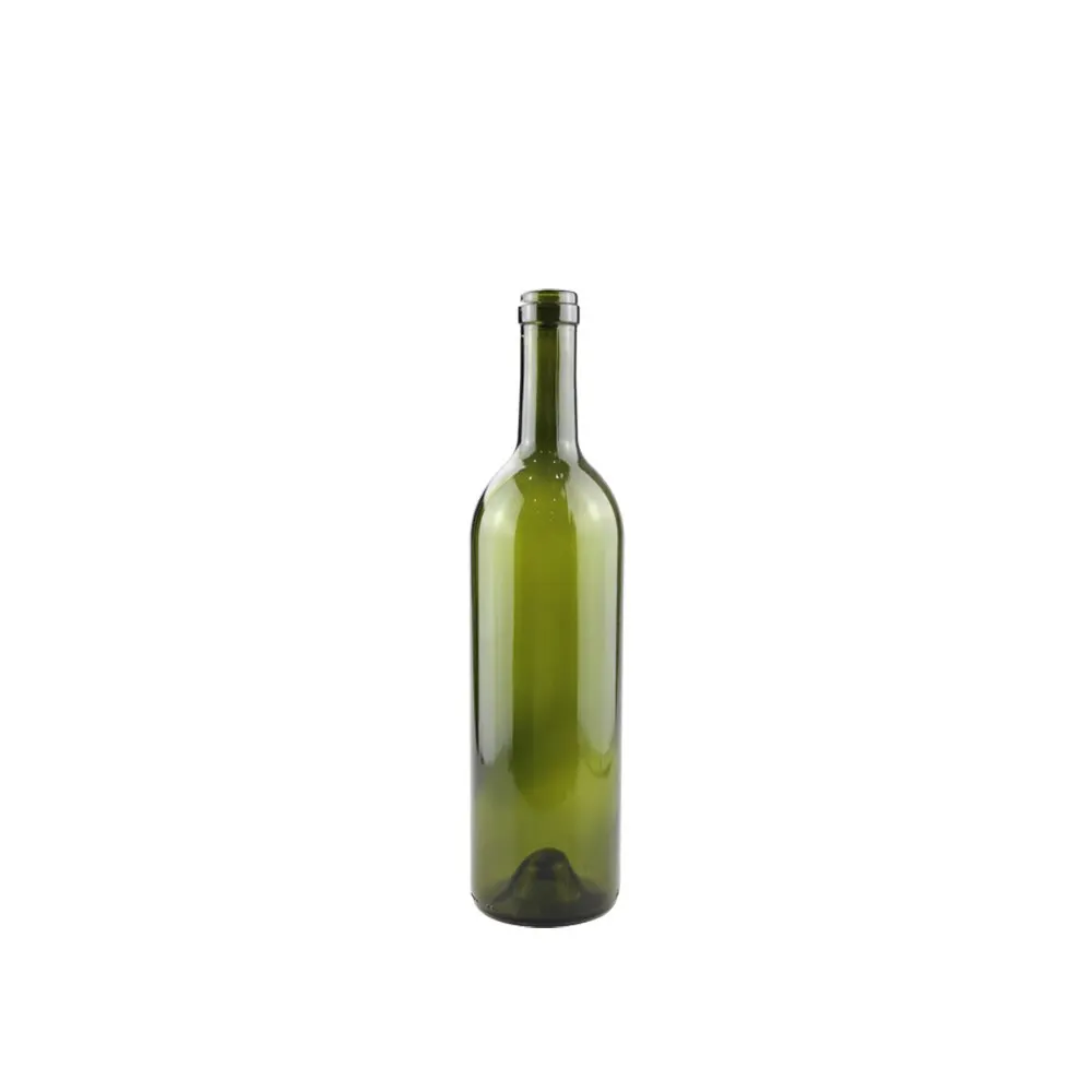
Part of our wine bottles wholesale range; the stock moulds are pictured at the end of this guide.
This page serves the winery, brand owner, importer or packaging company that has already settled the bottle format and now has to settle the decoration: which process carries the artwork, how much of a curved body can actually be printed or labelled, and what the filling or labelling line has to be able to hold. It treats custom wine bottle labels in the widest sense, covering artwork printed directly onto the glass, paper labels printed for you and applied on your own line, and the specification that governs either route. It deliberately does not cover bottle format engineering. Nominal capacities, brimful capacity, neck finishes and body diameters belong to the wine bottle sizes page, with the two dominant regional shapes handled separately on the Bordeaux wine bottles page and the champagne bottles page. If the artwork has to live in the mould itself, as an embossed crest, a moulded wordmark or a bespoke shoulder, that is mould development and belongs on the custom wine bottles page. If the open question is container loading, case and pallet configuration, or commercial terms, that is the wine bottle wholesale page, and the category overview sits on the wine bottles page. No tooling figure, unit price, minimum order quantity or lead time is quoted here, because each of those is an output of a finished specification and is confirmed on enquiry.
What “Custom Wine Bottle Labels” Can Actually Mean
The phrase is used for at least four different projects, and they have almost nothing in common once you are past the artwork stage. Separating them before anything else is quoted prevents the most common form of wasted development work, which is a buyer asking for custom labels for wine bottles while the scope is still ambiguous. The order below also determines the order of a wine bottle label design project, because each item constrains the next.
The first project is direct decoration of the glass. The artwork is printed onto the bottle body or shoulder itself, with no paper substrate. In practice this means fired organic screen printing, which is applied as a glass enamel and then passed through a decorating lehr so that the ink fuses to the surface, or an unfired UV-cured screen print, or hot foil stamping where a metallic foil is transferred under heat and pressure. Direct decoration is used when the brand wants the bottle to remain identifiable after the paper label has been removed, when the pack has to survive ice water or condensation, or when the design calls for a metallic effect that no paper label reproduces convincingly on a wet shelf.
The second project is the label itself as a printed item. Here the factory, or a nominated printer, produces the labels and the winery applies them. The variables are the substrate, the adhesive system, the dieline, the number of colours, and the finishing. This is where most wineries actually live, because it keeps label changes cheap and fast.
The third project is label application as a service. The labels are printed to a shared specification and applied to the bottles before shipment, so the winery receives a finished, decorated pack. This is a logistics decision as much as a decoration decision, and it is examined in its own section below.
The fourth project is the relationship between decoration and format. Label area is not a free variable. It is a function of body diameter, shoulder taper, the depth of any punt, and where the mould seam sits, which means the decoration brief and the format brief have to be resolved together even though they are handled on different pages of this site.
Choosing the Decoration Process: Volume, Colour Count and Curvature
Four process families cover almost everything a winery will be offered. The choice between them is driven by three inputs, and only three: the practical run size, the number of colours and special effects the design needs, and how much the artwork depends on a flat surface.
Screen printing on glass applies one pass per colour. Each colour needs its own screen, which is a fixed cost that does not vary with the run length, so the process gets cheaper per bottle as the run grows and becomes uneconomic for very short runs. Colour count is therefore the main cost driver, not bottle size. The fired version produces a decoration that is genuinely part of the glass surface and is not removed by normal washing, which is why it dominates returnable and premium beverage work. Its constraint is resolution: fine typography and photographic gradients are not achievable, and the design has to be built from solid areas and clean edges.
Hot foil stamping transfers a thin metallic layer from a carrier foil. It gives a bright, mirror-like gold, silver or coloured metallic finish that reads strongly under shop lighting and photographs well in marketing material. Foil can be applied over a printed underlay so that a design combines flat colour with metal, and it can also be applied onto a paper label rather than the glass. Its practical limits are the size of the stamped area, the fineness of the line work, and the way the foil behaves across a curved surface, where the stamping head has to follow the body radius.
Offset lithography on paper prints the label as a separate item, most often for wet-glue application. It handles many colours at low incremental cost, both spot colours and process builds, and it supports the widest range of finishing: varnishes, matt and gloss contrast, embossing and debossing, and cold foil. Because the substrate is paper or a synthetic paper, the artwork can be more detailed than direct glass decoration allows. The trade is that the label is a separate component with its own dimensional tolerances, and it has to survive glue, moisture and the bottle washer if the bottle is reworked.
Digital printing removes the fixed setup cost entirely. This makes it the natural route for short runs, for vintage changes, for sample and market-test volumes, and for anything carrying variable data such as a lot number, a QR code or a personalised name. Its cost per label stays substantially higher than litho at large volumes, and the choice of substrate and the durability of the cured ink have to be checked against the intended storage and handling conditions rather than assumed.
Curvature is the silent variable in all four. A label that measures 100 mm across sits on a chord, not a straight line, so the percentage of its width that lies within a flat viewing zone shrinks as body diameter shrinks. A design that looks calm on a 76 mm body becomes visually compressed at the edges when it is transferred to a 60 mm body without adjusting the type size and the margins, and this is a design consequence of the format decision rather than a printing defect.
Development Flow: Artwork, Proof, Approval, Production
Decoration projects fail far more often at the handover points than at the printing stage. A disciplined flow has six checkpoints, and each one exists to stop a specific class of error from travelling further downstream.
Step one, the decoration brief. The brief states the bottle format and diameter, the finished pack size, the process being considered, the colour references, the areas that must stay clear for mandatory wine information, and the handling the pack will see: chilled display, ice bucket, humid cellar, transport in a container. Colour references have to be given as a physical standard or a recognised colour system, not as a screen image, because a screen profile changes the colour it displays.
Step two, the dieline or print area drawing. For a paper label this is the cutting dieline supplied by the label printer. For direct decoration it is the printable band on the bottle: top and bottom limits on the body, the wrap angle, and any area occupied by the mould seam, embossed detail or a punt that changes the surface. Getting this drawing wrong is the single most expensive early mistake, because every later approval is measured against it.
Step three, the digital proof. A digital proof confirms layout, relative position and text content only. It cannot show ink behaviour on glass, foil reflectivity, or the colour shift that occurs when a printed ink is fused at decorating temperature. Treat this step as a content check.
Step four, the physical proof on the actual bottle. For direct glass decoration this is a decorated sample on the production format, and for paper labels it is a printed label applied to the production bottle rather than a flat sheet. Colour has to be approved on the real substrate, in the intended lighting, at the intended distance, because that is the only place where translucency, glass tint and curvature all act together.
Step five, the pre-production sample and first article approval. Once the process is fixed, a pre-production sample confirms that the approved appearance can be reproduced under production conditions. First article approval then defines the reference against which the run is inspected, with the inspection level agreed in advance, for example an AQL sampling scheme suited to the batch size and to the criticality of the defect.
Step six, production and inspection. Decoration is inspected against the approved reference, and the agreed defects are classified: colour drift beyond the tolerance that was set, registration error between colours, missing or incomplete areas of print, foil lifting at an edge, and label placement error. Transport packaging is assessed separately, since a pack can pass decoration inspection and still be damaged in transit; ISTA test protocols are the usual reference point for that question.
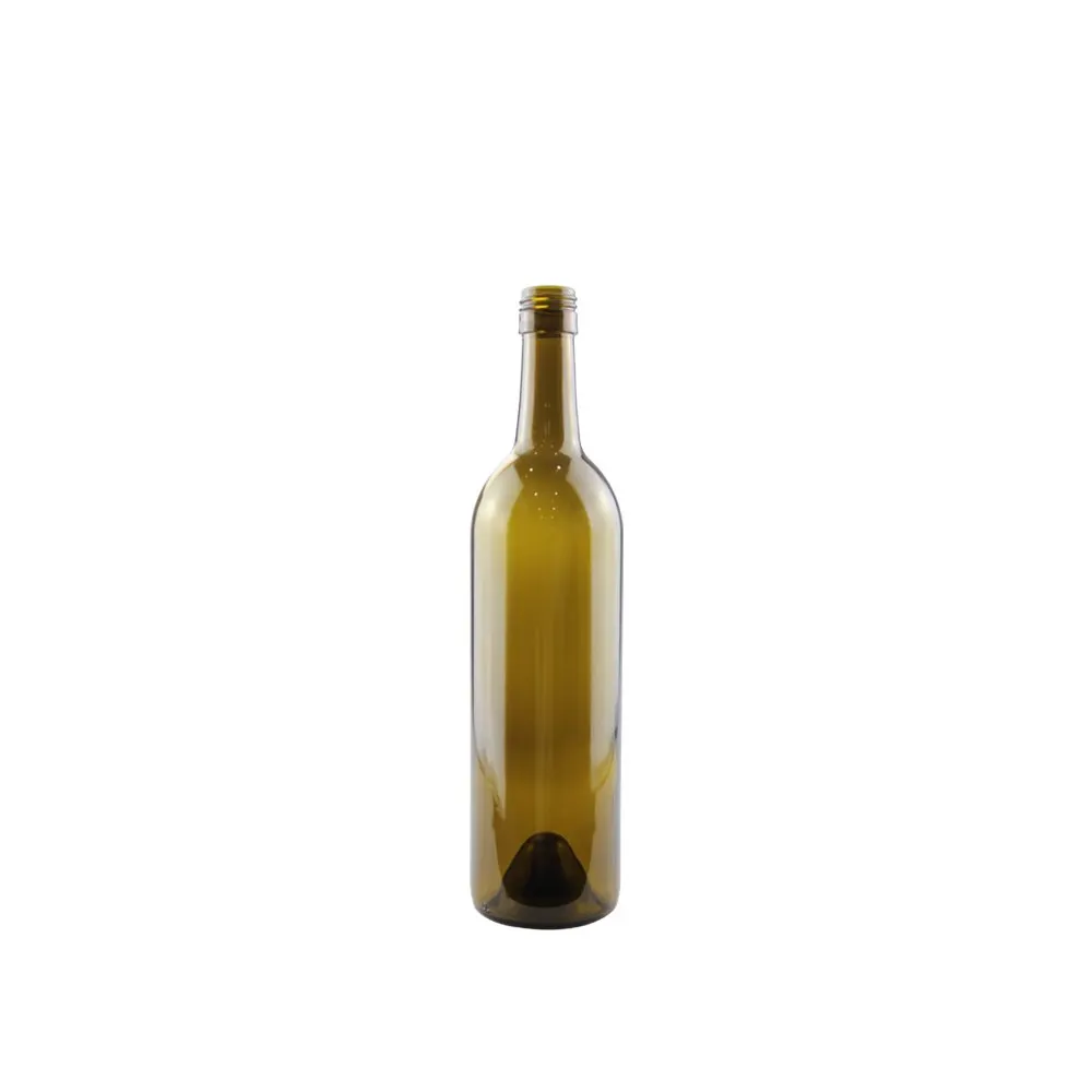
Decoration Process Selection Matrix
The matrix below compares the decorative routes that a winery or a drinks brand is normally offered. The volume bands are qualitative on purpose: the crossover between two processes depends on colour count, artwork complexity, artwork size and how many design changes are expected over the product’s life, so a single numeric threshold would be misleading. Read the last column as the list of things that have to be settled before the decoration is confirmed, not as a list of reasons to avoid a process.
| Process | Practical volume band | Colours and effect | Flatness requirement on the bottle body | Common failure |
|---|---|---|---|---|
| Fired screen print on glass | Best economics at sustained, repeat-order volumes; short runs carry the full screen cost | One pass per colour, typically a limited palette of solid colours; no photographic gradients; durable, wash-resistant finish | Very demanding: body must be round and the decoration band clear of the seam, embossing and shoulder taper | Edge lift at a shoulder taper, colour drift after fusing, thin lines closing up, ink shadowing at the seam |
| Unfired UV screen print on glass | Small to medium runs; useful where a durable look is wanted without a decorating lehr | Limited colour palette and simple shapes; gloss or matt effects; less resistant to abrasion than a fired finish | Moderately demanding: needs even surface contact, so strong curvature or embossing reduces quality | Scuffing in transit, adhesion loss after condensation, wear at the pack contact points |
| Hot foil stamping on glass | Small to medium runs where metal is the core of the design | Single metallic or coloured foil per pass, or a foil over a printed underlay; high visual impact, no gradient | Demanding: the stamping head must follow the radius, and surface variations show as patchy transfer | Partial transfer on a curved edge, foil lifting at fine line ends, ghosting where the die is not seated |
| Wet-glue paper label, offset litho | Medium to very large runs; the standard route for high-volume still wine | Many colours, process builds and spot colours, plus varnish, matt and gloss contrast, embossing and cold foil | Moderate: paper conforms better than a rigid print head, but a stable body diameter keeps placement repeatable | Wrinkling at the wrap edge, bubbles from glue spread, edge lift in a humid cellar, scuffing on the stack |
| Pressure-sensitive (self-adhesive) label | Small to medium runs, and any programme with frequent design changes | Wide colour range with digital, flexo or offset printing; clear-on-clear and textured substrates available | Low to moderate: the applicator follows the body, but very small diameters limit wrap width | Bubbles trapped under the adhesive, corner lift on a tight radius, adhesive squeeze at the seam |
| Digital print, label or sleeve | Very short runs, samples, market tests and variable-data work | Full-colour, single-unit variability for lot codes, QR codes or personalised details | Low for flat labels, moderate for sleeves that must shrink onto a shoulder | Colour variation between short runs, ink durability on a wet shelf, sleeve distortion at the punt |
| Shrink sleeve over the body | Medium runs where the whole body has to be covered | Full-body graphics, 360 degree coverage, high colour count | Low: the film follows the form, but the taper defines where the sleeve stops | Wrinkling at the shoulder, seam visible under strong light, tearing during transport |
Label Area, Bottle Curvature and the Legible Zone
Buyers frequently arrive with a label design that was drawn on a flat artboard and expect it to read the same way on the bottle. It will not, and the reason is geometry rather than printing. The label occupies a fixed length along a curve, so the wider it is, the further its edges turn away from the viewer. On a 750 ml still wine body of roughly 76 to 80 mm diameter, a label of about 90 mm width wraps close to half the circumference, which means the outer thirds are always seen at an angle. Practical designs therefore keep the primary brand mark and the varietal or product descriptor inside a central band, and let the outer areas carry texture or supporting content that survives being viewed obliquely.
The vertical dimension has its own constraints. The body of a still wine bottle is a cylinder for only part of its height; above it, the shoulder curves inward, and below it, the heel turns toward the base. Decoration that crosses either transition has to tolerate a change in surface angle. For paper labels the consequence is a wrap that fights the curvature and lifts at a corner. For direct screen printing the consequence is a print that thins or doubles where the squeegee meets the taper. In both cases the fix belongs in the dieline or print-area drawing, which is why that drawing is step two of the development flow rather than an afterthought.
Three further areas affect the usable label field. The first is the mould seam, a vertical line left where the mould halves meet; it is usually placed at the back of the bottle, and if the decoration wraps far enough to reach it, the seam will interrupt the print or lift the paper. The second is any embossed or moulded detail on the shoulder, which raises or lowers the surface locally and pushes a paper label into a bridge that never fully contacts the glass. The third is the punt, whose depth determines how much of the base area is usable for a back label that wraps low.
Finally, the mandatory information has to fit. Wine labels in most markets carry declared alcohol content, nominal volume, country of origin, the bottler or producer details, allergen statements where applicable, and increasingly a nutrition or ingredient declaration. The OIV publishes the international framework that many national rules draw on, and the destination market decides what is enforceable. Because these fields change without any change to the glass, they are a strong argument for keeping the regulated text on the paper label and using direct glass decoration for the brand identity, which is not editable in the same way.
Matching Label Line Tolerance to Bottle Tolerance
A label is placed by a machine onto a glass surface, and both sides of that interface carry variation. The decoration specification only works if the two tolerance ranges are compatible, so it is worth stating explicitly what each side contributes.
On the glass side, a container made to a given mould has normal dimensional variation in body diameter, height and verticality. Body diameter variation changes how far a wrap label has to travel and therefore where its trailing edge lands. Height variation shifts every label relative to the base if the applicator indexes from below. Verticality, meaning how far the neck leans relative to the base, changes the angle at which the bottle presents to the label head. Ovality, where the body section is not perfectly round, changes the contact pressure along the wrap and is a frequent cause of bubbles or edge lift that is blamed on the label. None of these are defects in themselves; they are normal glassmaking variation, and the useful question is whether they are being measured and declared rather than assumed to be zero.
On the filling line side, the variables are the label head itself, the accuracy of the bottle index, the glue or adhesive behaviour, the bottle temperature and surface dryness, and the speed of the line. Bottles that arrive cold and condensing will not accept a wet-glue label reliably. Bottles that have been stored in a dusty environment will not accept a self-adhesive label reliably. Self-adhesive labels applied below the manufacturer’s recommended minimum application temperature can bond initially and then lift in the warehouse, which produces a failure that appears weeks after the run and is often misdiagnosed as a bad adhesive batch.
The practical way to close this gap is to exchange three documents before the run: the bottle drawing with the dimensional tolerances stated, the label dieline with the placement tolerance stated, and a declaration of the label line conditions, covering line speed, application temperature, the substrate and the adhesive system. Where the intended bottle will be handled by a third party, packing and transport performance is assessed separately from decoration, and the ISTA test protocols are the usual reference for transit performance. Inspection of the finished pack then follows an agreed sampling plan, for example an AQL scheme selected for the batch size and the criticality of each defect class.
House Labels Versus Factory-Applied Decoration
The decision between printing labels for your own line and having the bottles arrive already decorated looks like a price comparison. It is better understood as a trade between control and handling.
Printing labels yourself keeps the artwork editable. You can run a small lot, change a vintage detail, add a market-specific allergen panel or a back-label promotion, and hold no more inventory than the labels themselves. It requires a labelling capability, whether in-house or through a contract packer, plus storage conditions for the labels: paper labels are sensitive to humidity and will curl or block if they are stored badly, and adhesive labels have a shelf life after which their tack is no longer assured.
Having the decoration applied before shipment removes a step from your filling operation and removes the risk of a label line that cannot hold placement to the tolerance the design needs. It also makes a fully decorated sample possible early, which is valuable when a buyer, distributor or retailer has to approve the pack before the season. The cost is flexibility: an applied decoration cannot be revised without a new production lot, and the practical run size required is set by the decorating process, which is heaviest for fired screen printing and lightest for digital and self-adhesive work.
A mixed approach is common and often the right answer. The brand identity, the colour field and any metallic effect go onto the glass, where they never change; the regulated text, the vintage, the lot code and any market-specific copy go onto a paper label that is applied later, where they are cheap to edit. The pack then looks premium and behaves like a flexible product. When this route is chosen, the decoration area and the label area have to be planned as one composition so that the two never compete for the same surface, and the label dieline has to be drawn against the decoration limits rather than against the bottle in isolation.
One point deserves a plain statement because it drives cost more than any other single decision: artwork that changes every season is expensive in any process that requires a screen or a plate, and free in any process that does not. If your marketing plan assumes an annual design refresh, that assumption should be on the table before a process is chosen, not after.
Common Failure Modes in Wine Bottle Decoration
The failures below account for most decoration complaints, and nearly all of them are traceable to a decision taken at the brief or the dieline stage rather than at the printing stage.
- Edge lift on a wrap label. The wrap crosses into the shoulder taper or into the heel radius, so the label cannot lie flat at its edges. Fix: reduce the wrap width or move the dieline inside the cylindrical band.
- Bubbles under a self-adhesive label. Usually a combination of surface contamination, low application temperature and an oval body section. Fix: confirm the cleanliness and temperature specification with the labeller, and check the body diameter tolerance on the incoming glass.
- Registration error between screen print colours. Compounded when each colour is printed in a separate pass on a curved surface. Fix: reduce the number of colours, increase the spacing between elements that must visually align, and avoid thin outlines that depend on perfect registration.
- Foil lifting or partial transfer. The die does not seat evenly across the curved surface, or the foil grade does not match the substrate. Fix: confirm the foil grade against the actual surface and keep fine line work away from the curved edge.
- Colour that does not match the approved sample. The reference was approved on a screen or on flat paper. Fix: approve colour on the production substrate, under the lighting in which the pack will be judged.
- Decoration damaged in transit. One bottle in a carton carries the load of the ones above it, and the contact points are exactly where the decoration sits. Fix: agree the carton and divider configuration with the decoration layout, and treat transit performance as a separate test question.
- Regulated text that no longer complies with the destination market. A market rule changed after the decoration was fixed. Fix: keep market-specific and regulated content on an editable label rather than in permanent decoration.
Where This Page Stops: Format, Mould and Volume
This article covers decoration and labelling only, and it is worth being explicit about where the neighbouring decisions sit, because decoration is one of the last specifications to be fixed and the most expensive to change.
If the format is not yet settled, start with the nominal capacity, brimful capacity, body diameter and neck finish, all of which are on the wine bottle sizes page. Format choice determines the label area and the printable band, so settling decoration before the format means settling it twice. The two shape families that dominate still wine are treated separately, with their own body diameters, shoulder profiles and label proportions, on the Bordeaux wine bottles page. Sparkling formats are a different engineering problem entirely, because the internal pressure changes both the glass weight and the closure, and that is covered on the champagne bottles page.
If the artwork must be part of the mould rather than applied to it, meaning an embossed crest, a moulded year or a custom shoulder form, the project has moved into development. Tooling, drawings and the sampling cycle for a new mould are handled on the custom wine bottles page, and decoration can be planned on top of that geometry once it exists. If the format and the decoration are both confirmed and the open question is pack configuration, pallet and container loading or commercial terms, that work belongs to the wine bottle wholesale programme page. For the category overview, including which formats suit which channels, the entry point is the wine bottles hub.
Frequently Asked Questions About Custom Wine Bottle Labels
Which decoration process suits a small first run of custom wine bottle labels?
For a first run, the fixed setup cost matters more than the unit cost, so digital printing on a self-adhesive label, or a short digital run of flat labels, is normally the cheapest way to see a design on a real bottle. Direct decoration processes need a screen or a die, which only becomes efficient at repeat volumes. A useful sequence is to validate the design on digitally printed labels, then move the elements that never change onto direct glass decoration once the design has stabilised and the volume justifies it.
Can I buy bottles from a factory and apply my own labels?
Yes. Most wineries do exactly that. You specify the glass, including the format, colour and finish, and separately specify labels that will be printed and applied on your own line. In that case the two specifications still have to be connected: the label dieline must be drawn against the actual body diameter, shoulder taper and mould seam position of the bottle you are buying, rather than against a generic template.
What artwork do you need in order to quote decoration?
Send the bottle format and, if available, the bottle drawing; the artwork as vector files with any placed images at print resolution; the colour references as a physical standard or a recognised colour system; the intended process if you already have a preference; the run quantity and the number of design variants; and a statement of the areas that must remain clear for mandatory label information. If a dieline or print-area drawing already exists, include it. All of these are quoted against a finished specification, so where a number is not yet known, mark it as open rather than guessing.
Why does my label wrinkle or peel on the bottle shoulder?
Almost always because the label crosses from the cylindrical body into the shoulder taper or the heel radius. A paper or film label cannot lie flat across a changing radius, so it bridges, wrinkles or lifts at the edge. The fix is geometric rather than adhesive: reduce the wrap width, move the dieline, or split the design into a body label and a separate neck or shoulder element that is sized for the local radius.
Do I need a new mould to have a custom label on a wine bottle?
No. Labels and applied decoration do not require tooling, because they are added to a standard bottle after it is formed. A new mould is only needed when the change is to the shape of the glass itself, such as an embossed crest, a moulded wordmark, a bespoke shoulder profile or a non-standard capacity. Those projects belong to mould development, and once the geometry exists, decoration can be planned on top of it.
How many colours can direct screen printing put on a bottle?
There is no single ceiling, but each colour is a separate pass and a separate screen, so cost and registration risk both rise with colour count. In practice, direct glass decoration is designed around a small number of solid colours with generous spacing between elements, and detailed multicolour artwork is moved to a printed label. The practical answer is to build the design around the process’s strengths, meaning solid shapes and clean edges, rather than to force a detailed artwork onto the glass.
How does bottle dimensional tolerance affect label placement?
Body diameter variation changes the distance a wrap label travels, height variation shifts the label relative to the base if the applicator indexes from below, and verticality changes the angle at which the bottle presents to the label head. The result is a placement window, not a fixed position. If the design has a tight requirement, for example the label must align with a printed element on the glass, the tolerance ranges on both sides have to be exchanged and compared before the run, and the design should be given enough visual margin to absorb the difference.
Should regulated wine information go on the label or on the glass?
In most cases, on the label. Declared alcohol content, nominal volume, origin, bottler details, allergen statements and any nutrition or ingredient declaration all depend on the destination market and on the specific wine, and market rules change. Content printed into the glass cannot be revised without a new decorating lot. The stable option is to keep brand identity and colour on the glass and keep the regulated and market-specific text on an editable paper label.
Send Artwork, Run Quantity and Bottle Format
A useful decoration recommendation needs three things. The first is the artwork or design file, in vector form where possible, together with the colour references and a note of which elements are mandatory, such as a regulated panel or a barcode. The second is the run quantity, expressed as bottles per design and the number of designs expected over the product’s life, because the number of variants can change the process recommendation even when the total volume does not. The third is the bottle format, ideally with the drawing or at least the body diameter, the height, the neck finish and any existing shoulder embossing or mould seam position.
With those three inputs, the process options can be narrowed to the two or three that actually fit, and the trade between setup cost and unit cost becomes visible instead of theoretical. It also helps to state the storage and handling conditions the decorated pack will meet, including whether it will be chilled, iced, stacked in a humid cellar or shipped through a cold or hot climate, because those conditions decide which failures have to be designed out at the proof stage rather than discovered at the shelf. Where a decision is not yet made, mark it as open; it is cheaper to compare two specifications than to re-decorate a finished order.