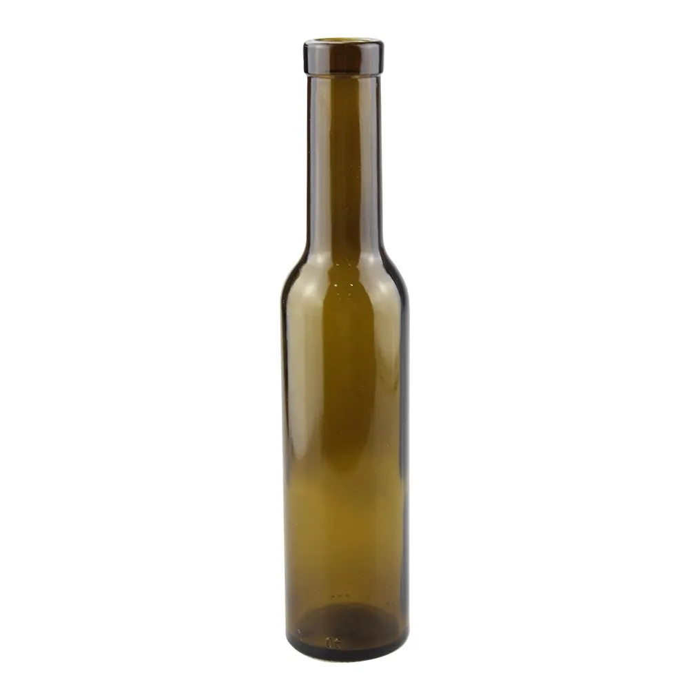
Filed under bulk olive oil bottles; the moulds we quote for this are pictured at the foot of the page.
This page is written for the olive oil brand owner, the co-packer or the importer who has already fixed the bottle and now has to make the label physically work on it. It treats olive oil bottle labels as an engineering problem rather than a graphic one: how a slender cylindrical body, a shoulder taper and a short neck limit where a label can sit, how much of a body panel is genuinely legible, how much of it has to be surrendered to mandatory declarations, and which facestock and adhesive survive oil, refrigeration and condensation. It assumes the label route has already been chosen. The comparison of decoration processes, the artwork approval flow and the general tolerances of applied decoration belong to the wine bottle labels page, which covers decoration as a process decision. The bottle itself is not specified here: shape families and their buying logic sit on the olive oil bottles page, while the capacity tier and the dimension that follows from it are worked out on the olive oil bottle sizes page. Commercial terms, order size and shipping configuration belong to the olive oil bottles wholesale page. Closures, pourers and inserts are a separate component group and are not covered here. No minimum order quantity, unit price, lead time or tooling figure is quoted on this page, because each of those is an output of a finished specification and is confirmed on enquiry.
What an Olive Oil Bottle Label Has to Do Before It Is a Design
A label on an oil bottle carries three loads at once, and they pull in different directions. The first is identity: it has to make the brand readable from a normal viewing distance on a shelf where dozens of similar green and gold packs sit side by side. The second is legal: it has to carry the mandatory particulars for the destination market at a legible size, in the required language or languages, and it has to hold a machine-readable code that the retailer’s till can read. The third is physical: it has to stay attached, flat and unmarked while oil runs over it, while the pack sits chilled, while bottles touch each other in a carton and while the pack is handled by a customer who has oily hands.
Most label problems on oil bottles are settled by the third load, and the third load is settled by geometry and material, not by the artwork. Custom olive oil labels are normally briefed as an olive oil label design exercise, and design is where the process starts by default. The difficulty is that a design approved on a flat screen proof, at 300 percent zoom, on a white background, has not yet been tested against the surface it will live on. This page works through the physical constraints in the order they bite: body curvature first, then the legible zone, then the declaration space budget, then the substrate and adhesive, then contrast, then the label combination, then the application method that has to place it all.
One thing is worth settling before any of the sections below, because it changes every number that follows. The label is sized against the real bottle, not against a nominal capacity. Body diameter, shoulder start height, heel radius, the position of the mould seam and the outside-diameter tolerance are all mould outputs, and they are what the dieline has to be drawn against. A dieline drawn against a catalogue illustration will be wrong by the width of the tolerance band, and on a narrow body a two millimetre error is visible.
Slender Bodies and Tight Radii: The Dimensions That Decide Fit
Three dimensions control whether a label behaves on a cylindrical body, and only three: the body radius, the width of the label across the wrap direction, and the calliper and stiffness of the facestock. Everything else is secondary.
The body radius is half the outside diameter. Olive oil bottles sit in a narrow band of diameters, and that band is deliberately slender, because a slim silhouette reads as premium and because a narrow body presents more bottles per shelf facing. A 250 ml bottle commonly runs around 45 to 55 mm in diameter, a 500 ml bottle around 55 to 65 mm, and a 750 ml bottle around 65 to 80 mm, with tall and slim variants at the low end of each range. Those are buying-band figures, and the exact diameter of a given mould has to come from the bottle drawing.
The radius matters because a wrap label is applied to a curve, and the distance around that curve is not the distance across it. The circumference is pi times the diameter, so a 45 mm body measures about 141 mm around, a 60 mm body about 188 mm, and a 75 mm body about 236 mm. Converting that into a design currency, each degree of wrap equals about 0.39 mm of label width on a 45 mm body, about 0.52 mm on a 60 mm body and about 0.65 mm on a 75 mm body. That single number explains why artwork that fits a 750 ml bottle looks crowded when it is dropped onto a 250 ml bottle without being redrawn.
The second consequence of curvature is foreshortening. A viewer standing in front of a shelf sees the centre of the label at full width and the edges compressed, because the surface there is turning away. The compression is the cosine of the viewing angle: an element sitting 30 degrees off centre appears at about 87 percent of its width, one at 45 degrees at about 71 percent, and one at 60 degrees at about half. Type and fine detail placed in the outer third of a wrap label therefore read at roughly half weight, which is one reason a logotype that looks generous on screen looks thin in the photograph the buyer takes in the shop.
The third dimension is facestock calliper. Label paper stock typically runs about 0.06 to 0.10 mm thick and film stock about 0.05 to 0.09 mm, and bending stiffness rises steeply with calliper, roughly with the cube of thickness for the same material. Moving from a 0.06 mm to a 0.09 mm paper therefore multiplies stiffness by more than three, and a stiffer label bridges a tight curve instead of following it, which is what a lifted trailing edge looks like on the shelf. Practical application limits quoted by label printers vary with the adhesive and the equipment, but as a working picture, conventional paper facestock generally wants a body radius above roughly 15 mm, conformable film grades reach down to roughly 8 mm, and below that the geometry starts to favour a shrink sleeve or decoration applied directly to the glass. Olive oil bottles almost always sit well above those limits on the body itself, which is why the body is rarely the problem. The problem is the shoulder.
Where the Legible Zone Ends on a Wrapped Panel
Wrapping a wide label around a narrow body is not the same as using the space. On a 45 mm body, a 70 mm wide label spans about 178 degrees of the circumference. On a 60 mm body the same label spans about 134 degrees, and on a 75 mm body about 107 degrees. If the comfortable reading zone is taken as roughly 120 degrees centred on the front, which corresponds to about 47 mm of arc on a 45 mm body, about 63 mm on a 60 mm body and about 79 mm on a 75 mm body, then the same 70 mm artwork is comfortably readable on a 750 ml bottle, partly sacrificed on a 500 ml bottle and has roughly a third of its width outside the reading zone on a 250 ml bottle.
That is the calculation to run before the artwork is drawn, not after. It answers the practical question that decides most oil label layouts: is this a single front panel, a front panel plus a declaration panel, or a wrap-around strip. On a narrow body, the honest answer is usually that the front panel must be narrower and the declaration content must move to a second panel or to the reverse of the wrap.
Tolerance has to be added on top of the geometry. Three error sources stack up: variation in the bottle outside diameter from one mould cavity and one production lot to the next, variation in the position at which the label is presented, and variation in how the bottle is presented to the label head, including how vertical it stands. The result is a placement window rather than a fixed position, and the design has to be drawn to absorb it. The practical rule is to keep the outer 3 to 5 mm of a wrap label free of anything that must align to something on the bottle, and to allow a bleed so that a small shift never exposes bare paper.
Verification is straightforward if it is planned. Measure the outside diameter at three heights on a sample of bottles, not one, because a moulded body carries a slight taper and the label takes up the diameter at the height where it actually sits. Measure the height at which the shoulder taper begins, the position of the vertical mould seam and the heel radius. Apply labels to a sample drawn across the production lot rather than from a single carton, following an attribute sampling plan such as the one described in ISO 2859-1, and inspect for edge lift at the trailing edge, wrinkles where the label crosses into a taper, and the alignment of the label relative to the shoulder line rather than relative to itself. Then run the storage tests that match the actual channel: a refrigeration hold at the temperature the pack will see, an ice-water or condensation cycle if the pack is presented chilled, an oil wipe along the label edge, and a rub or scratch check on the varnish.
Mandatory Declarations: The Space Budget Nobody Reserves
The declaration block is the part of the label that cannot be traded away for aesthetics, and it is the part most often designed last. It should be budgeted first. The list of particulars that applies depends entirely on the destination market and on the product, and it typically draws on items such as the legal product name, the net quantity, an ingredient list where the product requires one, a nutrition declaration where it applies, a best-before or date marking, a lot or batch code, the country of origin, the name and address of the responsible food business operator, storage conditions and a disposal or recycling statement. Which of these is mandatory, and in what wording, is set by the market rules, for example the food information requirements referenced in the United States under FDA 21 CFR or the food information regulation in the European Union, with the material-contact side governed by frameworks such as EU 1935/2004 and the plastics measure EU 10/2011 where relevant. The point here is not the legal text but the area it consumes.
Language count is the variable that catches buyers out. A pack sold into several European markets often has to carry the mandatory particulars in more than one language, and each additional language multiplies the text block rather than adding to it. A block that occupies a comfortable 45 mm by 35 mm panel in one language can need two or three panels once the second and third languages are added. On a slender bottle there is no spare panel, so the languages have to be counted before the format is frozen rather than after.
Two other items have hard size requirements and are frequently under-reserved. Mandatory particulars carry a minimum type size in many markets, with a widely used floor in the European Union of an x-height of around 1.2 mm for mandatory food information, which is larger on a printed label than most designers expect when they first set the block. And the retail barcode has a defined geometry: a standard EAN-13 at nominal magnification measures about 37 mm by 26 mm for the symbol itself, and once the required quiet zones and the human-readable digits are added, the practical reservation is a block of roughly 44 mm by 32 mm. Quiet zones are part of the symbol, not optional margin, and a barcode placed on a strongly curved part of the panel deforms enough to raise scan failures at the till.
The workable method is to reserve the declaration panel and the barcode block as fixed rectangles on the dieline before the brand artwork is laid out, then to proof the whole label at 100 percent scale on a physical print rather than on screen. A full-size paper proof placed on a real bottle exposes both problems at once: type that is nominally at the minimum size but physically too small to read in a shop, and a declaration block that has quietly grown into the brand panel. Where the destination markets are likely to change, keeping the declaration content on its own back panel makes commercial sense, because a market-specific text change then reprints one small panel instead of the whole front artwork.
Facestock and Adhesive Against Oil, Chilling and Condensation
Oil bottles are an aggressive environment for a pressure-sensitive label, and the aggression comes from three directions that are usually treated separately. Oil attacks the edge. Cold reduces tack. Condensation attacks the interface.
On the face side, oil that runs down the shoulder reaches the label edge and migrates slowly along the adhesive line, carrying dust and pigment with it. The visible result is a dark or grey halo along the edge long before the label actually lifts, and once oil has entered the adhesive layer, adhesion in that zone is effectively lost. The exposure is worst directly below the pourer, which is exactly where a neck or shoulder label tends to sit.
The facestock choice follows from how wet the pack gets. A coated or uncoated paper label gives the widest printing and finishing options and the best writing surface for a batch code, but it needs protection if the pack is wiped or chilled, which is normally a varnish or an overlaminate that wraps the edge. A synthetic film facestock, typically a polypropylene or polyethylene film in white or clear, resists water and oil on its own and conforms better to a curved surface, at the cost of a slightly different visual feel and less freedom in some finishing effects. A conformable film grade is the right starting point whenever a label has to cross from the cylindrical body into a shoulder taper. On a paper label destined for a chilled channel, a wet-strength grade with a sealed edge is a reasonable minimum rather than a premium option.
The adhesive is where oil resistance is actually won or lost. Permanent acrylic adhesives are the usual default for oil because they hold their properties against oil migration and against the moderate temperature swing of a warehouse and a chiller. Rubber-based adhesives are more aggressive initially and cheaper, but they are more vulnerable to oils and to solvent-like contents, and a rubber adhesive under an oil film at the label edge is a predictable source of edge lift. If the pack is presented chilled, the specification has to include an adhesive that keeps its tack at refrigeration temperature rather than one chosen only for room-temperature application, because a label applied warm and then chilled with a poor cold-performance adhesive will flag at the corners even though it passed the factory check. A freezer-grade adhesive is the appropriate reference point where packs are iced or held near freezing.
Condensation is a separate failure with the same symptom. When a chilled bottle is brought out, water beads on the glass and on the label face; if the label is applied to a bottle that is already cold or damp, moisture is trapped between the adhesive and the glass and the bond never develops properly. The controls are procedural as much as material: apply at a controlled ambient temperature to dry bottles, and if the channel is cold, test the finished pack through a real condensation cycle rather than a single cold soak. Where the oil itself is the concern rather than the water, the strongest single measure is to keep the label edge out of the drip path below the pourer, which is a placement decision that costs nothing.
Contrast Strategy: Clear Glass Against Dark Glass
The colour of the container is part of the label specification, because it sets the light budget the label has to work within. Olive oil is sold in clear flint glass, in pale green, and in dark green or amber glass, and the same artwork behaves differently on each.
On clear glass the oil itself is visible, and the oil colour becomes part of the composition. A clear bottle carrying a pale golden oil reflects light back through the pack, so an opaque white or cream label panel gives the highest text contrast and keeps small type readable. The reverse approach, a clear-on-clear label with the design printed in white and a transparent background, produces a very clean look on an empty bottle and a much weaker one on a filled bottle, because the artwork then sits on top of the oil and the green or gold behind it. Fine type and thin rules suffer first. If a clear label is required for the aesthetic, the type has to be set bolder and larger than a paper label would need, and the contrast has to be checked on a filled bottle, not a sample.
On dark glass, in dark green, antique green or amber, the container subtracts light and the label has to supply it. A light label block reads strongly and photographs well. A dark label on dark glass disappears in dim shelf lighting and in a photograph taken without care, which matters because the buyer’s first view of the pack is often a phone snapshot. Metallic finishes sit between the two: they catch directed light and read well under a shop spot, but they can flatten into a dull grey in a photograph taken with direct flash.
Two practical checks make contrast decisions objective rather than a matter of taste. The first is tonal separation: keeping a clear step between the type colour and its immediate background, so that small mandatory text does not sit on a mid-tone. The second is a physical viewing test at shelf distance under warm shop lighting and again under a phone camera, not on a calibrated monitor. The fill line matters too. A label that crosses the visible oil line changes contrast along its own height, since the lower portion sits against oil and the upper against air, and this is only visible on a filled bottle.
Label Fit Reference Table
The table below maps the body forms that oil is commonly bottled in against the fit problem each one creates, the facestock and adhesive family that answers it, the area the mandatory content typically needs, the panel combination that fits, and the items to confirm before the dieline is drawn. Areas are given as working bands, because the exact requirement depends on the destination market and on the language count, and the bottle dimensions have to be taken from the actual drawing rather than from a nominal size.
| Body form | Curvature and fit problem | Suggested facestock and adhesive | Approximate area needed for mandatory declarations | Suggested panel combination | What to confirm with the factory or the printer |
|---|---|---|---|---|---|
| Straight-sided cylinder, narrow body of roughly 45 to 55 mm diameter | High wrap angle: a wide front panel loses its outer thirds to foreshortening, and the wrap may exceed the comfortable reading zone | Conformable film or thin paper with a permanent acrylic adhesive; varnish or overlaminate if the pack is chilled | Roughly one panel of about 45 mm by 35 mm per language, plus a barcode block of about 44 mm by 32 mm | Front panel plus separate back panel; a neck label only if the neck is tall enough to take one | Actual outside diameter at label height, shoulder start height, mould seam position, outside-diameter tolerance, and the minimum type size for mandatory text in each destination market |
| Straight-sided cylinder, wide body of roughly 65 to 80 mm diameter | Radius is generous, so edge lift is unlikely; the risk shifts to a wrap angle wide enough to distort the barcode and to a panel that is simply too empty at the front | Paper facestock with a good finish is viable; permanent acrylic; overlaminate for premium finishes | The same content occupies a smaller share of the circumference, so two languages usually fit one wrap panel | Single full wrap label carrying front artwork, declarations and barcode, or front plus back for a quieter front panel | Whether the wrap is applied on a wrap-around station, and whether the barcode lands on a sufficiently flat part of the panel at the chosen wrap angle |
| Round shoulder or tapered shoulder form, including the classic oil bottle silhouette | A label that crosses from the cylindrical body into the taper cannot lie flat; it bridges, wrinkles or lifts, and a neck label has a very small radius to follow | Conformable film with a soft, high-conformability adhesive for anything crossing the taper; thicker paper only for the straight body band | Unchanged per language, but the usable area is reduced because the taper removes the upper part of the panel | Body label ending below the taper plus a separate narrow neck or shoulder element sized to the local radius | The exact height at which the taper begins, the shoulder radius, and whether the printer can supply a shoulder element cut to that radius |
| Flat-sided or flask form with a rectangular section | Flat faces take a label perfectly, but the corners are the problem: a large wrap label bridges the corner radii, and a front-and-back pair must be sized to the flat width only | Any facestock, including stiff paper, because the application face is flat; adhesive choice then follows the oil and cold exposure | Slightly lower, because two flat faces and their edge panels give more usable area per bottle than a cylinder of similar footprint | Front and back panels applied to the flat faces, or a wrap that stops short of each corner | The flat width between corner radii, the corner radius itself, and which labelling equipment can present a non-cylindrical bottle accurately |
| Square or square-round section | Four flat faces joined by radii; a wrap label cannot follow the sequence of flats and corners without wrinkling | Paper or film on the flat faces; avoid wide wraps entirely | Comparable per language, distributed across faces rather than around a circumference | Front face, back face for declarations, optional side panel for supplementary content | Which face the applicator indexes from, face width, corner radius, and whether any face carries a mould seam |
| Small gift or dipping bottle of around 100 ml or less | The body is short and the usable height is very limited, so vertical space runs out before wrap angle does | Thin conformable film to keep the label from dominating a small body; permanent acrylic; sealed edge if chilled | Declarations are proportionally the largest burden here, and a multi-language requirement can make a single small panel unworkable | Single wrap label with declarations printed on the reverse of the wrap, or a folded or booklet label if the market requires several languages | Whether a folded or multi-layer construction is acceptable to the printer and to the filling line, and the minimum body height available between shoulder and heel |
Neck, Body and Back: Layer Combinations as One System
Oil bottles are usually decorated with one, two or three separate label elements, and the choice between them is a space decision before it is a design decision.
A single wrap label is the simplest configuration and the cheapest to apply, because it needs one application pass and one dieline. Its limitation is that the front artwork and the declaration block compete for the same visible panel. On a wider body that is manageable, and on a narrow body it usually is not, unless the wrap is long enough that the declaration text sits on the reverse of the same strip, which the customer only sees when the bottle is turned. When a single strip wraps more than half the circumference, remember that the rear portion of the artwork is read on an upside-down surface relative to the front if the strip is continuous, so the layout has to be drawn as a strip with the rear block oriented for its own reading direction rather than as two pages side by side.
A front and back pair is the most common arrangement for oil, because it separates the two jobs cleanly. The front panel carries identity and the origin story at a size that survives the journey from shelf to table, and the back panel carries the declaration block, the barcode, storage advice and any disposal statement. Splitting also means a market-specific text change reprints only the back panel, which is the main commercial argument for the configuration. The cost is a second application pass and a second dieline, and the risk is that the two panels are applied at slightly different heights, which shows when the bottle is viewed from the side.
A neck label is the third element, and on olive oil bottles it is often proposed for a decorative band, a vintage reference or a quality mark. It only works if the neck offers a genuine cylindrical band to sit on. Many oil bottles have a short neck with a pronounced taper from the shoulder, and a small flexible element on such a neck will curl. Where the neck is short, the better answer is usually a shoulder or collar element that is cut for the local radius, or no neck element at all, and the space that would have gone onto a neck label moved into the main panel.
Two physical details cut across all three configurations. The vertical mould seam on a moulded bottle is a raised line, and a thin facestock laid over it will telegraph the ridge; keeping the seam away from the label edge, or accepting a heavier facestock, are the two available answers. And where bottles are packed shoulder to shoulder in a carton, the label-to-label contact point is where scuffing starts, so varnish or overlaminate and a small clearance in the shipper both protect the print.
Application Method Against Batch Size
How the label is placed determines how forgiving the design has to be, and the three application routes behave very differently.
Hand application, from sheets or a hand dispenser, is normal for market tests, samples and very short runs. Its weakness is placement repeatability: a person eyeing a label onto a curved body rarely holds better than a few millimetres, and air bubbles and wrinkles are common on a wide label applied by hand. The design response is to keep the artwork tolerant: a generous margin, no element that must align to a specific feature on the bottle, a wrap width that does not demand a perfect start position, and an adhesive that permits a slight reposition before it sets.
Semi-automatic application uses a machine to drive the label but relies on an operator to feed and present each bottle. Placement improves and output rises, but consistency now depends on how consistently the bottle is presented, so the bottle has to be dry, upright and seated positively. This is the stage at which the outside-diameter tolerance of the bottle starts to show up as position variation, because the label travels further around a larger bottle than a smaller one for the same start position.
Automatic application is a line decision. A wrap-around station needs a cylindrical body and a controlled diameter tolerance, and it needs the label roll, the wrap belt and the bottle to be matched. A flat-sided bottle is normally handled with a front-and-back applicator rather than a wrap station. Automatic application also brings the option of printing the lot code or the best-before date onto the label at the line, which requires that the substrate accepts the ink and that the marking area is not sealed under a glossy overlaminate unless the varnish is specified for marking.
The decision rule is straightforward. Below a certain run size, the cost of a tight dieline and a machine setup is not recovered, and a tolerant design applied by hand is the rational choice. Above it, a tighter dieline applied on a machine pays for itself in reduced waste and fewer customer complaints. Where a brand starts with a hand-applied first batch and moves to machine oil bottle labeling later, the dieline should be drawn for the machine from the start, because a dieline that only works by hand usually has to be redrawn at the point of changeover. What should not be done is to design a hand-applied label with machine tolerances built in, or to run a machine-applied label whose artwork has no bleed to absorb the position window.
Failure Modes on the Line and on the Shelf
Almost every complaint about an oil bottle label falls into a small number of patterns, and each one points at a specific cause rather than at label quality in general.
Edge lift on the trailing edge is the classic tight-radius failure. The facestock is too stiff or the label too wide for the body, so the label bridges instead of following the curve, and the last few millimetres never make full contact. The fix is geometric: narrower label, more conformable facestock, or a thinner calliper.
Wrinkling or lifting across the shoulder is the same failure on a tapering surface, and it cannot be cured with adhesive, because the substrate has to change radius. The label has to stop below the taper, or be cut for the local radius.
A grey or dark halo along the edge, with the label still attached, is oil migration into the adhesive line. It normally appears first below the pourer. The response is an oil-resistant acrylic adhesive, a sealed edge, and moving the label edge out of the drip path.
Flagging in the chiller, where a corner or edge lifts like a tongue, is a cold-performance problem or a moisture problem, and usually both. Either the adhesive was not specified for refrigeration temperature or the label was applied to a damp or cold bottle and trapped condensation at the interface.
Adhesive squeeze-out at the label edge after warm transit indicates an adhesive that is too soft for the temperature it sees in a container, and it also risks the bottles sticking to each other in the shipper. A firmer adhesive grade and a check on the transit temperature of the intended route are the levers.
Scuffed or rubbed print in the carton is a finishing problem, not a printing one. It is answered by a varnish or overlaminate, by reducing label-to-label contact in the shipper, and by checking how the bottles are nested rather than assuming they are.
A barcode that will not scan at the till is usually a size or placement problem. The symbol may have been printed below nominal magnification, or into a curve that deforms the bars, or with insufficient quiet zone. The fix is on the dieline and belongs with the declaration panel, not with the artwork later.
Where This Page Stops: Adjacent Pages and Their Boundaries
This page covers the physical constraints and the layout consequences of putting a label onto an oil bottle. It does not cover bottle selection. The shape families that oil is packaged in, and the reasons a brand ends up choosing between a round, a tapered-shoulder or a flat-sided form, are set out on the olive oil glass bottles selection page, which is the correct starting point when the format is still open.
It also does not cover capacity. Which size tier a brand should launch with, and how the tier changes the bottle dimensions that a dieline depends on, is the subject of the olive oil bottle sizes comparison page. Because the label is drawn against the actual body diameter, the size decision has to be settled before the dieline is drawn, not in parallel with it.
Where the question is commercial rather than physical, meaning order quantity, container loading, terms and the overall procurement sequence, that belongs to the wholesale olive oil bottle buying page. Label specification and procurement are separate decisions that meet at the point where a finished specification is quoted.
And where the open question is which decoration route to take in the first place, comparing direct printing against applied labels and working through the artwork approval sequence, the custom bottle label and decoration process guide covers that decision in general terms. This page assumes that route is chosen and works through what the oil bottle itself imposes on it.
Frequently Asked Questions About Olive Oil Bottle Labels
How do I know whether a label will actually fit my olive oil bottle?
Work out three numbers before looking at artwork: the outside diameter of the body at the height where the label will sit, the height available between the start of the shoulder taper and the heel radius, and the width of the declaration content plus the barcode block at the required type size. Convert the label width into wrap angle by dividing it by the arc length per degree for that diameter, and check whether it stays inside a comfortable reading zone of roughly 120 degrees. If it does not, the panel has to be narrower, the declaration content has to move to a second panel or to the reverse of the wrap, or the bottle format has to be reconsidered. All of this needs the real bottle drawing, because the catalogue diameter is a nominal figure and the dieline has to match the mould.
Can I place a label across the shoulder taper of an oil bottle?
It should be avoided. A label crossing from the cylindrical body into a taper has to follow a surface whose radius is changing continuously, and a pressure-sensitive label cannot do that without bridging, wrinkling or lifting at the edge. The workable alternatives are to end the body label below the point where the taper begins, or to use a separate narrow element cut to the local radius if a shoulder or neck decoration is needed. Conformable film facestock helps at the margin, but it does not remove the geometric problem, and the taper start height has to come from the actual drawing.
Which adhesive should be specified for an oil bottle that is sold chilled?
An adhesive that retains tack at refrigeration temperature, rather than one selected only for room-temperature performance. Permanent acrylic adhesives are the usual default for oil exposure because they resist oil migration along the edge as well as temperature swing, and a grade intended for cold or freezer conditions is the appropriate reference point where packs are iced or held near freezing. The other half of the answer is procedural: labels should be applied to dry bottles at a controlled ambient temperature. A label applied to a cold or damp bottle can trap condensation at the interface, and it will flag later even though the material itself was suitable.
How much room should I reserve for mandatory information on the label?
Reserve it first, not last, and reserve it as a rectangle on the dieline before laying out the brand artwork. The requirement depends on the destination market and on how many languages have to appear, and each additional language multiplies the text block rather than adding to it. Two fixed items are frequently under-reserved: the minimum type size that many markets impose on mandatory particulars, and the barcode, where a standard EAN-13 symbol occupies roughly 37 mm by 26 mm before the quiet zones and human-readable digits are added, giving a practical reservation of about 44 mm by 32 mm. Where markets are likely to change, keeping the declaration content on its own back panel means a text change reprints one small panel instead of the whole front design.
Is a clear or transparent label a good choice on a clear oil bottle?
It depends on how much of the design is fine print. A clear-on-clear construction looks clean on an empty bottle, but on a filled bottle the artwork sits directly over the oil, and the green or gold behind it reduces contrast, with thin rules and small type suffering first. If the aesthetic is required, the type has to be set larger and heavier than a paper label would need, and the contrast has to be judged on a filled bottle under shop lighting and through a phone camera rather than on a monitor. Where the label has to carry a dense declaration block at the minimum type size, an opaque panel is the safer specification.
Do I need a neck label as well as a body label?
Only if the neck presents a genuine cylindrical band to sit on. Many oil bottles have a short neck that tapers quickly out of the shoulder, and a small flexible element applied there will curl rather than lie flat. Where the neck is short, the better options are a shoulder or collar element cut to the local radius, or no separate neck element at all, with the space folded into the main panel. Adding a third element also adds a third application pass and a third opportunity for misalignment, so it should be justified by space or by a specific brand purpose rather than by habit.
Can labels be applied at the factory before the bottles are shipped?
Labels can be supplied in rolls or sheets for the buyer to apply, or the decoration can be applied before shipment so that the pack arrives finished. That is a logistics and commercial choice rather than a label-specification choice, and it affects where the declaration content is finalised, since a pack decorated before shipment is harder to change once markets or languages shift. Whichever route is taken, the dieline still has to be drawn against the real bottle, and the application method still sets the placement tolerance that the artwork has to absorb.
Send the bottle form, the target market or markets and the list of mandatory particulars you have to carry, and we will come back with a label size and a material recommendation drawn against the actual dimensions of that bottle rather than against a generic template.