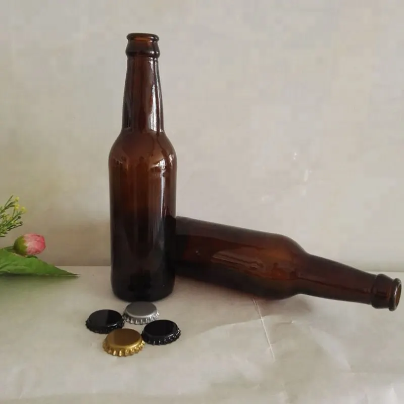
Filed under amber glass bottles wholesale; the moulds we quote for this are pictured at the foot of the page.
Quick answer
Should a glass bottle be amber or clear?
Choose amber when light is what degrades the contents. Amber holds back ultraviolet and most visible blue-violet light, while clear glass stops only the deepest ultraviolet. Choose clear when the product sells on appearance and is stable in light. Amber usually costs more and is held in stock less often, and clear glass with a UV absorber is a middle option.
| Contents | Usual colour |
|---|---|
| Essential oils, aromatic materials | Amber or dark amber |
| Herbal tinctures, alcohol-based extracts | Amber |
| Pharmaceutical and nutraceutical liquids | Amber in most cases |
| Beer, dark spirits | Amber, brown or dark green |
| Gin, vodka, white rum | Clear |
| Vinegar, syrups, honey | Clear |
Choose amber when light is what actually ages the contents, and clear when shoppers buy the product by looking at it and the formula tolerates shelf lighting. Clear is the colour most widely made and held in stock, so a specific amber shade in a specific shape is more likely to need a dedicated run. Carry both colours only when a structural reason exists: two channels with different needs, a light-sensitive variant inside a stable range, or a private-label customer who names the colour.
Four variables behind the colour choice
"Amber protects, clear sells" is a fair slogan and a poor planning tool. It folds four independent questions into one, and each can point a different way. Getting three right and one wrong still ends in a pack change, which costs far more once moulds and artwork exist.
- Light protection. Amber stops ultraviolet and most visible blue-violet light, the band that harms the largest group of sensitive contents. Clear stops only the deepest ultraviolet. A third route is often forgotten: clear glass with an ultraviolet absorber, which covers the ultraviolet range and still looks transparent.
- Visibility of the contents. In many categories seeing the product is a selling function, not a taste. A colour that hides it has a cost that no quotation shows; it appears in units sold.
- Cost and availability. The two colours differ through the colourant, and also through what plants normally produce and keep on the floor.
- Stock complexity. One colour is one item to forecast and age. Two colours are two, each with its own carrying cost and obsolescence risk.
A channel and regulatory layer sits around these. Labelling rules rarely dictate a colour, but a mandatory declaration needs room and contrast, which can favour one pack over another. Some category conventions are strong enough to act as requirements with no written rule behind them, and a pack that breaks one reads as an error to buyers before any technical case is heard. Name all four variables and the channel convention first; do not pick a colour and argue backwards.
The optics themselves, meaning which wavelengths each colour blocks and how a transmittance curve is read, are covered in our note on UV blocking and light transmission in glass bottles. What follows assumes that question is answered.
Work from contents to channel to stock
Colour decisions that begin with a favourite colour are the ones most often reversed after launch. The dependable order starts at the product, and every step removes options.
Contents and sensitivity tier
A material that light damages within weeks must take a protective route whatever else is true. A material that light barely affects has no protection argument, so appearance and cost decide alone. Most commercial products fall between the two, and in that band a stability result outweighs any opinion. It is the measured tier, not the category label, that makes the later steps meaningful.
Channel
The channel fixes how much the pack must show and how much light it will meet. An open retail shelf gives continuous exposure and a glance-length judgement, so visibility is worth most exactly where the light dose is highest. Trade routes such as a pharmacy counter, a spa or a specialist distributor store and handle goods in ways that lower both, so a protective colour gives up less there.
Online selling is its own case. Shoppers choose from studio photographs, which can show the contents whatever the glass colour, and the bottle spends its life in warehouses and transit, not under shop lighting. One product can therefore justify different colours in different channels, and a range sold through both is a real reason to run two.
Volume and stock
Colour only turns expensive when it has to sit in inventory, be forecast over a season and be protected from going obsolete. A shade that can be drawn from stock in small lots is low risk even at a higher unit cost. A shade that must be produced to order in a large run is high risk even when each bottle is cheaper. Unit cost and total cost of ownership are different numbers, and inventory policy explains most of the distance between them. Shade and supplier come after these three steps.
Colour by product category
The table runs from contents that effectively require amber or another dark colour, through a middle group where either colour can be defended, to contents where clear is the natural pick and a protective colour would need its own justification. Misplacing a product between these groups is the costliest error in the whole decision: in the top group the penalty is a shelf-life failure, not a matter of taste. Placement follows measured sensitivity, never the product's price point or how sophisticated it seems. Note also that two rows can land on the same colour for unrelated reasons.
| Contents | Usual colour and reason | Channel where it sits comfortably | Effect on stock | Confirm with the plant |
|---|---|---|---|---|
| Essential oils and aromatic materials, which are extremely light sensitive and degrade fast under shelf lighting | Amber, dark amber or an opaque route. Clear is not normally considered, because failure comes too quickly to trade against appearance | Professional, trade, pharmacy and e-commerce, where pressure to show the contents is lower | One protective colour for the range. The exposure is a slow-moving shade, not a colour pair | The shade band offered across every size needed, so a single colour covers all SKUs |
| Herbal tinctures, alcohol-based extracts and botanical actives, which are highly light sensitive | Amber by default. Because degradation is slower, an ultraviolet-absorbing clear body can sometimes be weighed as a middle route | Professional and specialty retail, or selective retail where the bottle is displayed in a carton | One colour is normally enough when the whole range shares the sensitivity. Adding another doubles forecasting and ageing risk | Whether ultraviolet-absorbing clear truly exists in that shape and size, and whether it is stocked or produced to order |
| Pharmaceutical and nutraceutical liquids, syrups and medicated preparations | Mostly amber, with ultraviolet-absorbing clear where the format demands visibility. Protection here is functional, and batch-to-batch consistency counts | Pharmacy, clinical and professional settings that understand what amber signifies | Often a single colour, held to a tighter shade band than a decorative one | How the shade is specified and how variation between deliveries is controlled |
| Beer, dark spirits and some fermented drinks | Amber, brown or dark green. Clear appears only on short-life, fast-turning formats. The dark glass protects and also matches the category code | Retail and hospitality, where a dark bottle is expected | One colour per product line. Seasonal products bring a second colour and a second ageing risk | Whether the shade is stocked or produced to order, and what minimum run applies if the latter |
| Wine and olive oil | Dark green, amber or clear according to positioning. The category accepts a wide palette, so brand usually decides more than physics | Retail and specialist food shops, where the bottle signals style as well as contents | Frequently two colours, hence two forecasts and a higher chance that one goes stale | That both colours can be produced in one shape and finish, keeping tooling common |
| Vodka, gin, white rum and other clear spirits | Clear, or a tint so light it passes as clear from shelf distance. Drinkers expect to see the liquid, and colour would alter the product's identity | Retail and hospitality, competing on the shelf and the back bar | Single colour. The exposure is a light-related complaint after long shelf time, not obsolescence | Whether a light ultraviolet-absorbing grade keeps the clear look, and whether channel exposure is long enough to warrant it |
| Vinegar, syrups, honey and preserved foods | Clear in the great majority of cases. Shoppers inspect the product, and sensitivity is usually low | Grocery and general retail, where the shelf does the selling | Single colour with fast turnover, which limits ageing risk | Whether shelf exposure in the target channel justifies any ultraviolet protection at all |
| Water-based cosmetic fluids, lotions and cleansers | Mostly clear, since the category is judged by eye and formulas are generally stable. Amber where an active ingredient reacts to light | Retail, e-commerce and specialty beauty, where the bottle forms part of the display | Often two colours in a line: clear for the core range, amber for an active-led variant | That the amber variant shares the clear bottle's shape, so caps, labels and filler settings carry over |
| Natural and clean-positioned actives, serums and oil blends | Amber, often a light amber that stays readable. It protects, and in this category it also signals "natural" | Specialty retail and e-commerce, where amber is a recognised cue | Single colour with a controlled shade band, because light and dark amber look very different from a few steps away | Which amber shade is being quoted, and whether it repeats across sizes and reorders |
| Clear juices, functional drinks and vitamin-fortified beverages | Clear, or ultraviolet-absorbing clear for a sensitive formulation. The drink must be seen, and a tint would spoil that | Retail and e-commerce, where colour and clarity are judged | Single colour. Ordinary versus ultraviolet-absorbing clear is a specification choice, not a stock one | That the absorbing grade is identified on packing documents, so the two clear glasses are never mixed up |
| Household, technical and industrial liquids that light does not affect | Clear, or a light tint chosen for brand reasons. With no protection case, colour is purely cost and identity | Trade and industrial distribution, where looks carry little weight | Single colour picked for availability | Whether the lightest, most available colour is also the cheapest at the buyer's volume, which is common but not certain |
For the shade families themselves, see the colour options across clear, amber, green and specialty tints. Shapes and neck finishes are listed in our glass bottle collections.
How cost and availability differ between amber and clear
Amber usually costs more than clear. How much more cannot be stated honestly before a specification exists, so it is quoted per project. What can be explained in advance is the direction of each cost component, because those directions tell a buyer whether the gap in a particular programme will be wide or narrow.
Colourant and melt control
Amber is produced by a deliberate iron and sulphur chemistry that has to be managed in the furnace. That is a process burden on top of a material one, and it grows when the shade must be held tightly, as it must for functional pharmaceutical use compared with decorative use. Clear has a smaller burden running the other way: a truly neutral clear is a controlled product, whereas a clear allowed to drift slightly green is not.
Run size and what is kept in stock
Clear is the most widely produced and most widely stocked colour in most sizes, so a clear requirement can often be filled from a standard body with little or no dedicated setup. Amber is common without being universal. A particular amber in a particular shape may call for its own run, which lifts the effective minimum on a small order and stretches the schedule. Non-standard colours follow the same logic more sharply: the minimum is set by the run that justifies a furnace colour change, not by how many bottles the buyer wants.
The general pattern is that standard colours arrive soonest, customised shades take longer, and a shade nobody holds takes longest of all. This sets a trap when comparing offers. A stocked clear quotation and a produced-to-order amber quotation can sit side by side on a spreadsheet while describing different delivery schedules and different minimum quantities. Bring both to the same service level before reading the unit prices.
Costs that sit outside the bottle
Colour changes what can be seen during filling: fill height, foam, particulates, sediment and glass defects. A clear body reveals a short fill instantly, and an amber one may not. That alters how operators and inspectors work, and it limits how much of an automated inspection setup can be reused if the line later switches colour. None of these is a large line item alone. Added up, they often outweigh a small difference in bottle price.
Running one colour or two
A single colour across a range is easier to forecast, buy and store, cheaper to hold, and carries exactly one colour risk: a slow size leaving dead stock. Two colours double the stock items and the forecasting work, and they add the chance that one sells while the other ages. In return, one physical pack can serve two channels and may open a market that a single colour cannot reach.
Three situations justify the second colour:
- A channel split. The product sits on a lit shelf in one market and moves through a professional or online route in another, and the two want different degrees of visibility.
- A product split. The core variant is stable and meant to be seen, while another is built around a sensitive active that needs protecting.
- A customer-specified colour. On an own-label or private-label programme the customer sets the colour, and it need not match the house range.
Wanting to give buyers a choice is not on that list.
When two colours are carried, three habits keep them manageable. Keep shape and finish identical so that caps, closures, labels and filler settings are shared and the glass is the only difference. Designate one colour as held, meaning stocked to cover short-notice demand, and the other as produced to order against a forecast over a longer horizon. Plan seasonal and obsolescence risk on purpose: a colour that suits a summer range can be wrong for winter, and an odd lot in the wrong shade is much harder to clear than an odd lot of a neutral one. For a customer-specified colour the same rules hold with the roles reversed, and the stock discussion belongs before the shade is fixed.
Tooling and validation when the colour changes
Changing colour on an existing bottle does not normally call for a new mould. The mould gives the glass its shape; colour belongs to the glass composition, not to the cavity. Three cases complicate that short answer.
- A change of colour route. Going from an amber body to a clear body carrying an external film, or from a body colour to a sprayed finish, changes the number of operations, the equipment and the applicable quality controls. The mould stays untouched all the same.
- A composition change that affects forming. This is unusual but possible. Some colourants shift the working characteristics of the glass, so a plant may adjust forming parameters or, in extreme cases, its assumptions about tooling wear, with cavity geometry unchanged.
- A pack with regulatory or functional meaning. This one is most often missed. The brand's quality system or a customer's specification may demand re-validation, which is a paperwork and testing exercise, not a tooling one.
So treat tooling and validation as two questions. First get written confirmation that shape, finish and mould stay as they are; if so, physical risk is low. Then ask what evidence the new colour needs. Does an existing stability result still stand once the pack colour differs? Does the customer's specification allow the change without notice? Does any regulatory submission or labelling approval refer to the pack colour? A change that carries no tooling risk can still be costly to re-validate, and the two costs should be assessed independently.
Cobalt blue, emerald green and custom colour matches
Cobalt blue and emerald green are the special colours brands request most for identity. Both are tinted glasses offering partial protection of a particular kind, not the broad cover amber provides. Cobalt lets blue and violet light through and blocks the warm end of the spectrum. Emerald holds back much of the blue-violet and passes green. Each is a real filter that suits some contents and does nothing useful for others, so neither is a general stand-in for amber. A brand picking one for its look should verify the optical consequence as a separate matter.
Commercially they behave differently from the two standard colours. Fewer plants produce them, so availability is narrower and it is likelier that the required size and shape is not held. The minimum tends to be higher because the furnace colour change has to pay for itself, and the shade frequently has to be developed or matched instead of chosen from a standard band. A custom match to a brand colour sits at the far end. Handle it as a development project with a matching stage, a sample approval stage and its own timeline, not as an order line.
A special colour earns those constraints under one of three conditions: it carries brand meaning no standard colour can; it runs across a range big enough to absorb the minimum; or it meets a protection need the standard routes miss. A preference voiced late does not qualify. The usual failure is a special shade requested once standard tooling and artwork are already signed off, which forces either a costly restart or an unwanted compromise. If a special colour is at all likely, raise it when the project opens.
Handling a colour the customer has specified
Own-label and private-label projects usually arrive with the colour already decided. Four steps, taken in order, keep that colour from turning into a recurring dispute, since each clears up ambiguity for the next.
- Establish whether the colour is a named standard or an open target. A customer who says "amber" may accept any reasonable amber within a band. A customer who names a brand colour has set a target to be matched and approved. Confusing the two causes most later arguments.
- Compare the target with the house range. Say openly whether it can be met by a standard colour, by a near-standard colour needing a small adjustment, or only by new development. Each outcome carries its own timeline and minimum, and the customer should see which applies, not just a price.
- Agree the acceptance rule before production. Settle what the colour is compared against, under which light, and how much variation is tolerated, so a delivery can be judged and not debated.
- Fix the stock position. Decide who holds the colour, against what forecast, and what happens if the customer's volume never materialises.
Where the colour is a new development and the volume uncertain, allocate the risk of the minimum explicitly. A minimum that nobody has agreed to carry becomes a commercial argument later.
Effects on the filling line and the label
The line only ever sees the glass, so a colour switch is a line decision as much as a packaging one. Four effects need planning, and none shows up on a bottle quotation.
Fill-level and product inspection
Through clear glass the operator and any vision system can see fill height, the foam line, particulates and sediment directly. Amber hides some or all of this. If fill level is checked by eye or by an optical sensor, a darker bottle may require a different sensor, a new inspection setting or another verification method. Raise this with the filling operation before the first run; it is a machine and procedure change.
Closures and the light path
The neck finish is unchanged when only colour changes, so in principle caps behave as before. In practice the closure is part of the light path. An unlined or light-transmitting cap admits light to the headspace, which quietly defeats the extra protection people expect after moving to a darker bottle. When light is the limiting route, discuss the cap liner alongside the glass colour.
Labels and decoration
Adhesion and appearance both depend on the surface beneath the label. Body colour changes how a design reads, so artwork approved on clear glass can turn illegible or simply look wrong on amber. If the colour is a sprayed finish, the label is going onto a film, and that film's adhesion and abrasion behaviour joins the label specification.
Changeover and scrap
Switching colour means clearing the previous one from the line. That adds changeover time and creates short-run scrap that a single-colour programme never generates. Where one line fills two colours, this is a recurring cost of the two-colour policy and should be weighed against the cost of holding the second colour in the first place.
What to send for a colour recommendation
We can recommend a colour, or a pair, once three inputs are on the table, because they determine nearly everything downstream.
- Category and product type. State whether the contents are oil-based, alcohol-based, water-based or a food, and attach any stability data already in hand. This fixes the sensitivity group and shows whether protection is a real constraint or an assumed one.
- Every channel, by name. A pack sold both on a lit shelf and online poses a different problem from one that moves only through a distributor.
- Estimated annual volume, split by size. Minimum quantities and stock policy operate per size, not per brand.
Mention at the outset any likelihood of a second colour or a customer-specified shade, since either alters the tooling and validation path. From there we can propose the colour or pair, a stock policy naming the held colour and the one produced to order, and the points to verify on tooling, line settings and label performance. Any ranges mentioned at that stage are planning orientations to narrow the brief. They need confirming against a real specification and delivery schedule before anyone treats them as approved figures.
Two neighbouring questions sit elsewhere on the site. How long a filled pack lasts once its colour is settled, and how light interacts with oxygen and temperature over that time, is covered under shelf life in glass packaging. For a specific container instead of a colour decision, see amber Boston round bottles.
Frequently asked questions
Is amber glass the better choice for every product?
No. It helps only where light is a genuine ageing route. On a product that light does not affect, amber adds colour, cost and a visibility penalty and solves nothing. It also achieves little where oxygen or heat drives degradation, because the limiting reaction lies elsewhere. Ask whether light is the binding constraint; if not, appearance, cost and channel should decide.
Can one bottle design be supplied in both colours?
Usually, since only the glass composition differs. Geometry is not the limit; availability and minimum quantity are. Check that the same shape is actually offered in both colours before building a range around it.
Is amber more expensive than clear?
In most cases, yes. The size of the gap depends on the shade, the volume and how tightly the colour has to be controlled, so it is quoted against a specification. Compare total cost at an equal minimum and an equal delivery schedule, not unit prices at different service levels.
Does a colour change mean re-validating the pack?
Possibly. The answer lies in your quality system and your customer's specification, not in the glass. A stability result obtained in a different pack may no longer apply, a specification or artwork approval may need updating, and customer or regulator records can be affected where colour has functional meaning, as with amber pharmaceutical glass. Ask before the change, and keep re-validation as a line item separate from tooling.
Which channel should set the colour?
Generally the one where light exposure and the need for visibility are both highest, because that is where the two constraints collide hardest. A lit retail shelf exposes the product most and rewards transparency most. Professional, clinical and online channels put less weight on visibility and can take a more protective colour.
How many colour variants should be held in stock?
As few as the channel structure permits. Each added colour multiplies stock items and brings the risk that it ages while the other sells, so hold a second only for one of the structural reasons described above.