One of our guides on boston round bottles wholesale; start there for the overview.
Choose amber for a Boston round when the liquid reacts to short-wavelength light and the bottle will sit where light reaches it; in that case the glass is the barrier and the colour has to be specified tightly. When the contents are stable, or a carton already shields the pack for most of its life, amber is a category habit rather than a necessity and clear, frosted or another colour can be defended. The decision rests on three inputs: what is in the bottle, how much light the pack will meet on its way to the user, and whether a secondary barrier is planned.
What amber does, and why it became the convention
Amber glass absorbs much of the ultraviolet range and a good share of short-wavelength visible light. Those are the wavelengths behind the oxidation and isomerisation reactions that alter the smell, colour and behaviour of a botanical oil, so the technical case for amber is sound.
The other half of the story is history. Amber was the least expensive colour to make in volume for pharmacy glass, a generation of oils and tinctures went into it, and buyers came to expect it. A convention saves a decision, but it can also mean paying for protection twice. A cold-pressed citrus oil rich in photo-reactive constituents needs a real barrier. A heavy resinous base note in dark amber glass, packed in a printed carton, held in a warehouse and displayed in a closed cabinet, is shielded several times over with nothing measurable gained.
Which of these two situations applies also determines how strictly the colour is bought. Where amber is functional, two visibly different batches mean two levels of protection and a mismatch on the shelf, so the tolerance must be narrow. Where it is only convention, a looser tolerance is commercially acceptable. Disputes over colour consistency usually trace back to a buyer who never settled which requirement they had.
Assess the contents and the channel first
Contents
Calling a liquid "natural" or "botanical" says nothing about its sensitivity. What matters is which constituents it contains and in what proportion. Some oils degrade mostly through contact with oxygen; for those, headspace and closure count as much as the glass. Others respond to particular wavelengths, and there the glass is the main control. A blend may do both. Without this assessment, the colour is being chosen on looks.
Channel
One formula can need different protection in different routes to market. Dispensed from a closed cabinet in a professional setting and used up within weeks, it meets little light. On an open retail shelf under continuous store lighting for months, it meets a great deal. Sold online, shipped in a carton and kept in a bathroom cabinet, it meets less than either. This is why two brands can put chemically similar products in different glass colours and both be right.
The order of decisions
Taken in a fixed sequence, the colour question is settled once. Taken out of sequence, it tends to be reopened repeatedly.
- The contents and their sensitivity profile.
- The exposure the product will really see, which follows from the channel and from any planned secondary barrier such as a carton.
- The barrier function those two together demand.
- Glass colour, as one way of delivering that barrier alongside any secondary packaging.
- The closure, because it changes the headspace and so the oxygen exposure — sometimes a bigger factor than the light question that started the discussion.
- Capacity and neck finish, where a Boston round comes in a limited set of standard combinations and the issue is availability more than taste.
Colour is the most visible variable, so buyers tend to fix it first and defend it longest. It is inexpensive to change before artwork is printed and before there is a reorder history, and disruptive afterwards. Settling the barrier requirement beforehand turns the colour into a conclusion that will stand up in a specification.
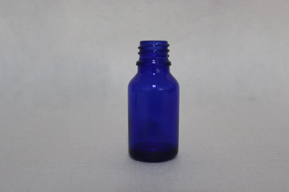
Colour route by sensitivity level
The table turns a sensitivity assessment into a colour route, the test that would support it, and the point to raise with the glass plant before a quotation. A colour recommendation with no way of verifying it is only an opinion.
| Contents and exposure | Glass colour | Reasoning | Would a label do instead | Shelf-life check | Confirm with the plant |
|---|---|---|---|---|---|
| Cold-pressed citrus oils and other strongly photo-reactive single notes, on an open shelf under continuous lighting | Amber, held closely to a retained reference | Amber absorbs most strongly in the reactive range, and on a display shelf nothing else stands between light and liquid | No. Shoulder and neck stay bare, and the oil shows through above the label edge | Accelerated ageing of filled, closed samples under defined light, against a dark-stored control from the same batch | The colour reference, the tolerance agreed, and whether that reference can be held on a reorder |
| Absolutes, resinoids and blends with a long shelf life in open-shelf channels | Amber, or cobalt blue if the brand system needs it | Either lowers transmission in the reactive range; once the barrier is met the choice is mostly commercial | Only as a full wrap backed by a carton; a partial label leaves the stored pack exposed | Treated and control samples compared over the intended shelf life, with blind sensory assessment | Whether the amber or blue tone can be matched across two capacities made in separate runs |
| Moderately sensitive blends sold mostly online and shipped in a carton | Amber as the safe default; clear where visibility is a firm brand requirement | The transit carton shields the product for most of its life, which lowers the demand on the glass | Yes. The carton does most of the work and the label adds a layer | Realistic exposure testing with the carton included, not bare bottles under a lamp | Whether the carton specification is final, since the colour depends on it |
| Chemically stable base and fixative oils used within a short period | Clear or frosted, in line with the rest of the range | Little reactive chemistry to protect, so colour can follow the brand | Not applicable; nothing significant needs blocking | An ordinary stability check over the use period, not a light-exposure study | Whether clear glass can hold a strongly coloured oil without complaints of a colour cast |
| Alcohol-based tinctures and herbal extracts, where the closure carries more risk | Amber, with the closure picked for solvent compatibility, not looks | Amber deals with light in the usual way, but ethanol attacks liners and some plastics sooner than light harms the extract | In part. A wrap helps with light and does nothing about evaporation or closure ageing | Weight loss tracked over time alongside the exposure study, because evaporation and oxidation compete as failure modes | Maximum ethanol concentration, the liner material touching the liquid, and the cap torque the filling line applies |
| Carrier and massage blends in larger formats, opened often | Amber to match the small sizes; clear where the larger pack is a display piece | Frequent opening exposes the contents more than the glass colour does, so less is asked of the barrier | Yes; closure and headspace outweigh the glass here | Tests built around repeated opening cycles, not continuous storage | Which closure and orifice suit the viscosity, and whether a pump or disc-top takes the place of the dropper |
| Highly sensitive actives in a cosmetic serum using the same small format | Amber or opaque-coated glass with a complete secondary barrier | For extremely sensitive actives, glass colour is rarely sufficient alone and the pack is built as a total barrier | Only within a total barrier system, never as the single measure | Stability work specific to the formulation, not a generic exposure test | Whether an opaque coating is offered on that moulding and how it behaves at the fill line |
Amber compared with green, cobalt blue and clear
These four colours do not line up on one scale. Amber and cobalt blue each cut transmission in the reactive short-wavelength region, though by different means, and both are picked as much for how they look as for what they block. Green falls between amber and clear across most of the relevant range and is normally a brand-system choice. Clear glass stops essentially nothing in the visible range; it suits stable contents or products where seeing the liquid is part of the appeal.
Commercially, the stronger colour matters less than the one that can be supplied consistently in every capacity and finish the project calls for. A deep amber that cannot be matched between a 15 ml and a 30 ml bottle produces an obvious inconsistency across the range, a worse problem than a marginal difference in transmitted light between amber and blue. A green moulded in only one capacity pushes a second colour into the line the moment a size is added. Checking the Boston round size range before fixing a colour avoids both traps.
Our working rule is that amber remains the default for light-sensitive contents. Departing from it needs one of two justifications: evidence that the contents are less sensitive than assumed, or a secondary barrier that carries the protection. Applied honestly, the rule gives different answers for different products.
How far a label or carton can stand in for amber
Opaque labels, wraps and cartons are proper components of a light barrier, and in some designs they are the main one. The error is to count on a label alone for a bottle kept in open light.
A label shields the body. Shoulder, neck, closure and the band of glass above the label edge remain uncovered, and on a Boston round that adds up to a meaningful fraction of the surface through which light passes straight to the liquid. A carton works differently because it encloses the entire pack. It is a true barrier, but only while the bottle is inside, and in retail the carton is often taken off for display or kept just until purchase.
The practical method is to treat glass colour, label coverage and secondary packaging as one barrier, then test that combination against the worst stretch of the product's life. Inside a closed display unit, less is required of the glass. Open under store lighting, the glass does the work and a label contributes little. If no carton, sleeve or shrink band is planned at all, the glass is the only protection between filling and sale, and a colour picked for appearance may leave the contents with none. Bottle proportions matter too: a taller bottle of equal nominal volume shows more bare glass around a label of the same size.
Fill level and closure
Amber only delivers what it promises if two process details are right. One is headspace. More air above the liquid means more oxygen, and oxidation carries on however well the glass filters light. A tight fill and amber glass work together; neither replaces the other. Put the fill line in writing, leaving room for the closure but no needless air column.
The other is the seal. A dropper whose soft gasket creeps under torque gradually stops sealing, and a bottle that leaks in a parcel network is a commercial failure well before the oil has degraded. Alcohol-based contents make this worse, since the solvent attacks the liner and also evaporates faster. Glass colour, fill level and closure form a single system and should be agreed with the closure supplier together.
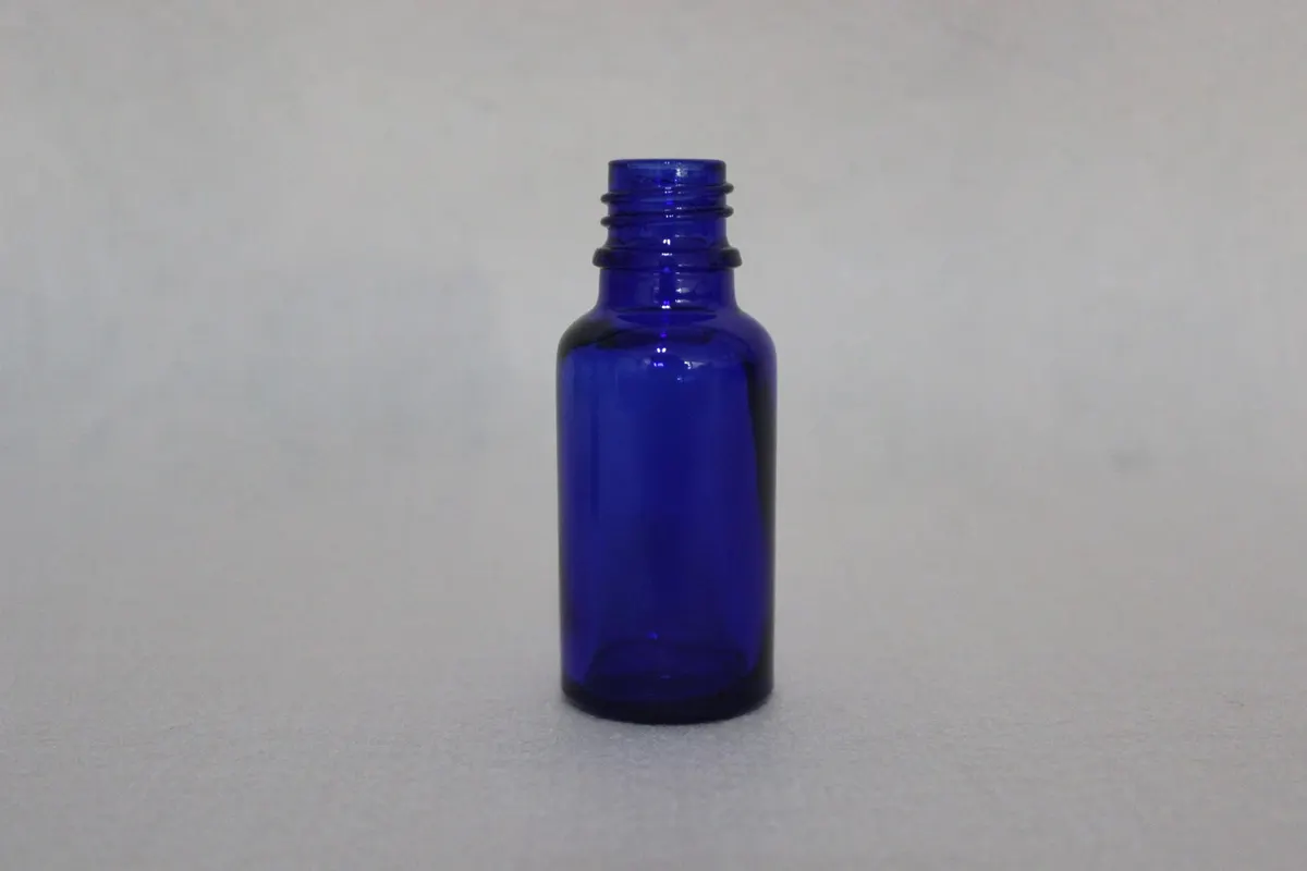
Verifying the colour choice against a control
A shelf-life test only means something when there is a control. Fill a number of bottles from a single batch, keep one set under defined light and the other in darkness, and assess the two sets on an identical schedule. Protocols differ by product and market, and no generic method replaces work done on the actual formulation. What the comparison does show is whether the glass colour is making a measurable difference.
Regulatory frameworks buyers cite
Regulation seldom addresses glass colour. For a glass container holding a cosmetic or food-related liquid, the rules concern material safety and migration, and they bear on the closure, the labelling and, in some markets, the pack configuration.
- United States: food-contact and drug-packaging expectations are framed around FDA 21 CFR provisions.
- European Union: food-contact materials come under the framework of EU 1935/2004, with plastics-specific measures in EU 10/2011.
- Fragrance uses: essential oil and fragrance applications may also fall under IFRA guidance.
These are public frameworks that buyers commonly reference in a specification. Naming them is no claim about any particular production run; the requirements that apply must be confirmed for the specific product, market and intended use.
What to send for a colour recommendation, and where related questions are answered
Three items let us give a firm recommendation with its reasoning: the contents and how light-sensitive they are, the shelf-life target, and the quantity band you are planning, along with the fill volume in millilitres. Tell us if a carton, sleeve or full wrap is already in the pack design, because it changes how much the glass has to do. If no sensitivity assessment exists, say so plainly; a recommendation built on a guessed profile is the commonest reason a colour is reopened after sampling. In return you should get a colour route, a note on whether a label or carton alters it, and the closure points that go with the contents.
Some questions sit upstream or alongside the colour decision:
- If the pack type, capacity convention or the choice between dropper, roller and pump is still open, start with the overview of essential oil bottles; the colour decision assumes those are settled.
- For how one moulding family spans several capacities with shared finishes — needed before committing a colour across several SKUs — see Boston round bottles in wholesale supply.
- For neck finish, pipette, gasket and drop rate, where most leaks and dosing faults begin, see the guide to dropper bottles.
Frequently asked questions
Does every essential oil product need amber glass?
No. A stable base oil that is sold in a carton and kept closed gets little from it. Amber earns its place when the contents truly react to short-wavelength light and are stored where that light can reach them.
How do amber and cobalt blue differ in practice?
Both lower transmission in the reactive region, and amber is the more conventional choice for pharmacy and aromatherapy packs. The practical difference is often supply: which of the two can be delivered in a consistent tone across every capacity in the range.
Is an opaque label a replacement for amber?
Only under particular conditions, such as a full wrap with a carton behind it. In general a label is best counted as an addition to the barrier, because light still enters at the shoulder and neck.
Why does a shelf-life test need a dark-stored control?
The control separates the effect of the glass from the formulation's natural ageing. Without it, a change in the light-exposed samples cannot be attributed to light.
Are amber Boston rounds suitable for tinctures as well as oils?
The glass is; the closure frequently is not. Tinctures are harder than oils on liners, gaskets and some plastics, and evaporation past a creeping seal can outpace light damage. If one bottle is to serve both product families, select the closure for the more aggressive of the two and state the maximum ethanol concentration when you enquire.
Which closures and droppers fit an amber Boston round?
Fit is set by the neck finish of the specific moulding and has nothing to do with colour. Glass pipette droppers, roller fitments, child-resistant caps over a dropper insert, pumps and plain screw caps are all used on this shape. The pipette must be long enough for its tip to reach the liquid at the intended fill line, so fill volume and closure are best specified together.