One of our guides on glass tequila bottles; start there for the overview.
A square bottle earns its place in a tequila range when the brand needs flat faces: large panels for embossing, frosting and labels that sit true, plus an angular outline that shoppers read as deliberate and traditional. It also packs tighter on shelf and in a carton than a round bottle. The trade-off is a custom mould with higher tooling cost and a shape that exposes every proportion error, so it pays off only when the decoration and positioning actually use those panels.
What the flat panels give a brand
A cylinder bends light and artwork around a curve. A square or rectangular bottle offers flat planes instead, and each one catches light in a controlled way. That is the reason designers pick the format for tequila sold in the upper tier: detail that would blur on a curved wall stays crisp.
The outline matters as well. Consumer research links angular forms with strength, reliability and tradition, which suits a spirit sold on heritage. Rounded forms come across as informal and approachable, which is fine for casual categories but works against a serious, upmarket tequila.
Handling is the third cue. Defined edges give a different grip from a cylinder, and the bottle feels controlled in the hand. Where a bottle is unboxed, poured from at home and left on display, that contact is part of what the buyer paid for.
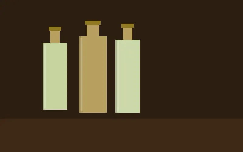
Decoration options on a square bottle
The table sets out what each technique gains from a flat face. For how these fit into wider packaging direction, see our notes on glass bottle design trends for 2026.
| Technique | Why a flat panel helps | Typical use on tequila |
|---|---|---|
| Embossing | Needs a large, uninterrupted plane; raised glass picks up ambient light and gives a three-dimensional effect | Distillery name, heritage date, patterns drawn from traditional Mexican craft |
| Frosting | Renders more cleanly and evenly than on a curve | Limited-edition variant of a clear core bottle |
| Gradient tint or two-tone colour | Transitions can be placed with more precision | Coloured release within the same range |
| Adhesive label | Lies flat, so bubbles, misalignment and lifting edges are far less common | Front and back labels with fine custom artwork |
Label consistency deserves a second look if the budget has gone into label design. Curved walls are where bubbling and edge lift usually show up on long runs; a flat face removes most of that risk and protects how the brand looks on every bottle, not only on the approved sample.
One mould family, several releases
A square bottle also lends itself to a modular range. A brand can launch in plain clear glass, add a frosted limited edition later and follow with a coloured version, all on the same mould family. Tooling is paid for once and the packaging can still change from release to release.
Shelf and freight efficiency
Round bottles leave empty corners between them in every row. Square bottles close that gap, so a retailer fits more facings into the same footprint. Denser rows make planogram placement easier to win, and placement drives visibility.
The same geometry applies in transit. Bottles that nest tightly need less freight volume for the same count, from the glass plant through the distribution centre to the store, which lowers emissions per bottle delivered. If that figure feeds into your reporting, our glass packaging sustainability data gives the wider context.
When square adds cost without return
A custom square bottle carries higher upfront tooling cost than a stock shape, and the volume a plant will ask you to commit to rises with mould complexity. Both are quoted per project; the drivers are the mould, the decoration, the quantity and the freight terms.
That spend is justified when the design uses what the shape offers: embossed panels, clean labelling, surface finishes, a planned series of variants. A square bottle carrying a small paper label and no surface work gets the tooling bill without the benefit. The same applies to a brand built on an easygoing, approachable image, where an angular bottle pulls against the message.
The shape is also unforgiving. Every face and edge is equally visible, so a proportion that is slightly off shows from all sides. Our guide to custom spirits bottle shapes and how they affect perception covers the same judgement for other formats.
How to brief and develop a custom square bottle
We match square-bottle projects to a suitable glass plant and check drawings before a mould is cut. The projects that run cleanly tend to follow the same order.
- Bring the plant in at concept stage. Tolerances, the way glass behaves in a square mould and the limits of each finish are known to the people who run the shape. A rendering can look right and still produce uneven wall thickness, distortion on cooling or label adhesion trouble once glass is in the mould.
- State volume early. Quantity and mould complexity set the commercial terms, so they belong in the first brief rather than the last email.
- Insist on physical samples. Samples come from soft tooling or an early production run. Judge proportion, weight distribution and visual effect in the hand, because a bottle that looks balanced on screen often feels different.
- Put development in the product calendar. Seasonal collections and limited editions miss their window when mould making and sampling are not planned in from the start.
Decide the decoration plan before the drawing is frozen. Embossing depth, frosted areas and label panels all depend on the size of the flat faces, and those cannot be changed once the mould exists.